Domo vs DataFocus Cloud
Business intelligence (BI) assists organizations to make decisions, take actions, and execute business processes. It has many benefits including faster data analytics, more efficient work, etc. As two BI platform based on cloud, Domo and DataFocus Cloud (DFC) provide beautiful visualizations to help make data-driven decisions.
DFC has simpler, clearer, and more systematic interfaces. With easy and convenient operations, users can create beautiful visualization charts and dashboards. Also, with comprehensive role management as well as resource management, collaboration is easy and extensive.
The two platforms have many differences in terms of interface, visualizations, management, and etc. This article compares the two tools to help business elites choose a more suitable one.
1. Introduction
As a low-code data app tool, Domo utilizes the power of BI to combine as well as process data. It integrates data, BI, and apps for everyone to use.
Likewise, DataFocus Cloud is a zero-code data analysis platform, where everyone can start analytics with a low learning cost. Exploring data is as easy as a search, everyone can be a data expert.
2. Comparison
2.1 Interface
Overall, DataFocus Cloud has a neater and more systematic interface. While there is much information on Domo’s interfaces, beginners may find it overwhelming and may take a certain amount of time to study how to use the system first. This section only introduces some pages rather than all.
2.1.1 Novice Guide
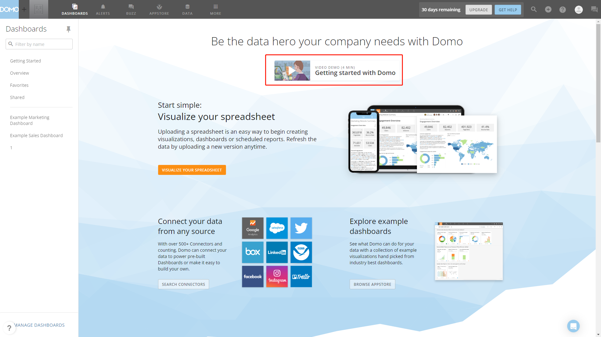
The two tools both put videos on the home page to guide beginners. Domo uses a four-minute video demo to introduce how to connect data, create a card, and how to share a card. Other options on the page lead to different functions of the system, as shown in figure 2-1.
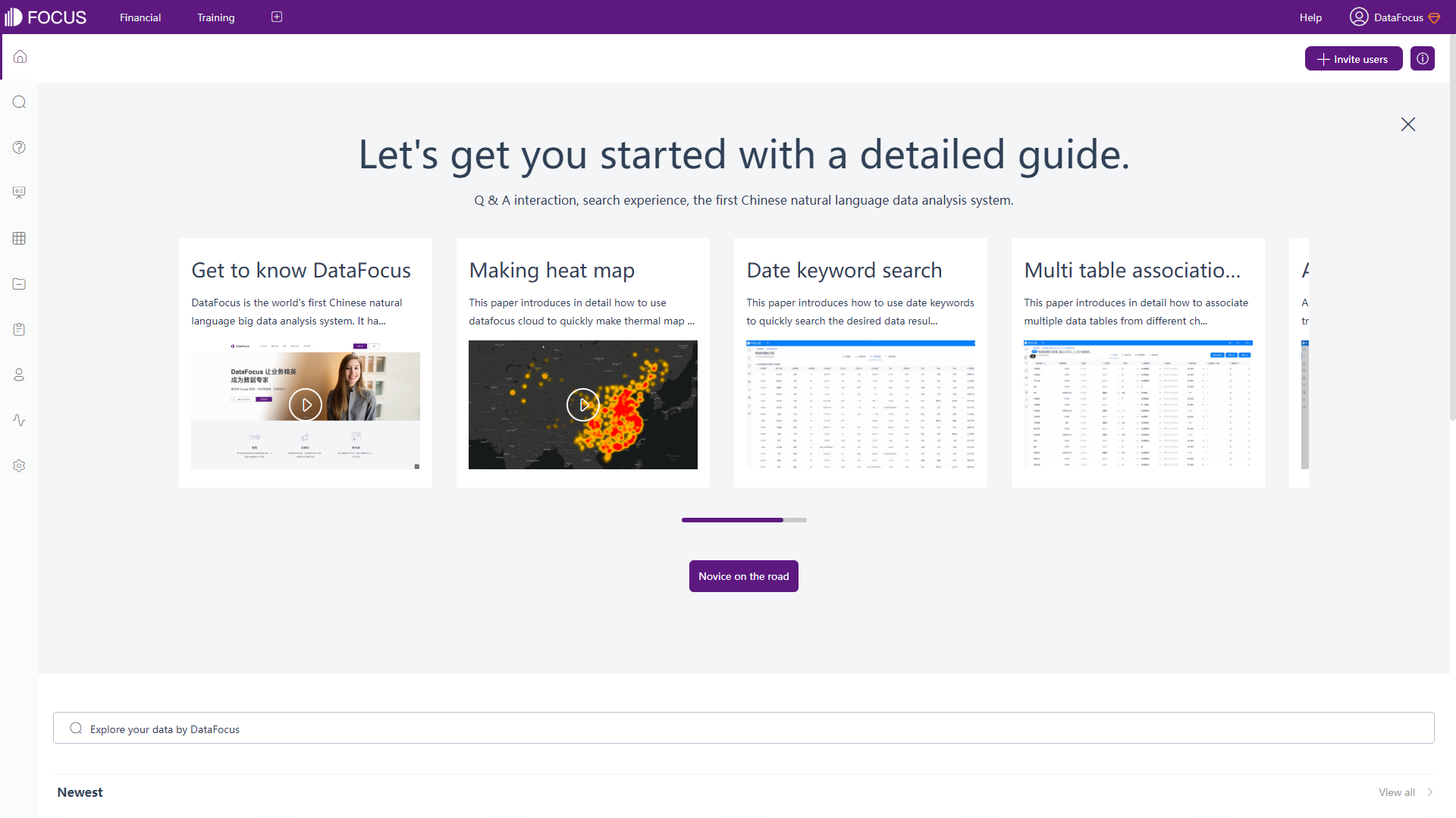
As shown in figure 2-2, several videos are listed on the guide window of DFC,such as keywordsearch,charts making, etc. Users can choose to close the guide window and revisit it later. The home page displays resources by “Newest” and “My Collection” category.
2.1.2 Navigation Bar
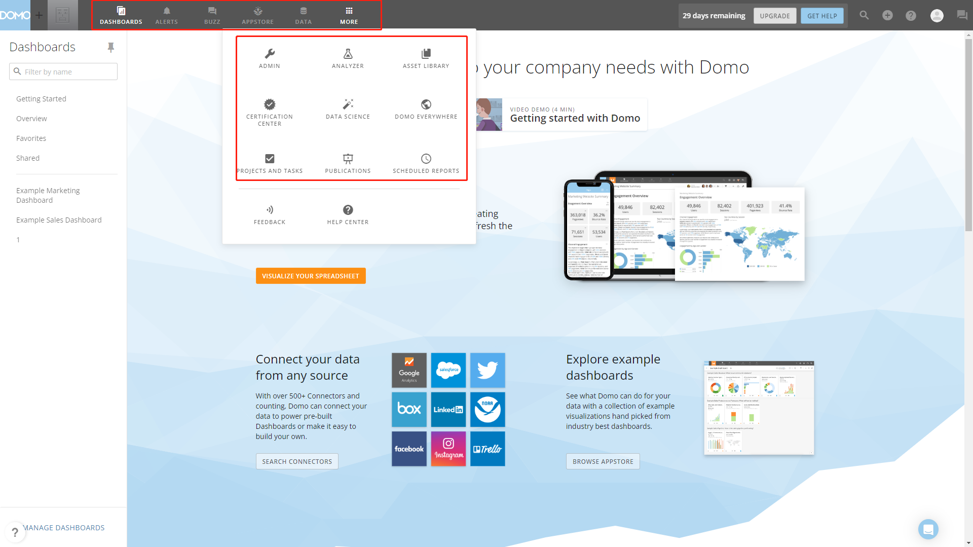
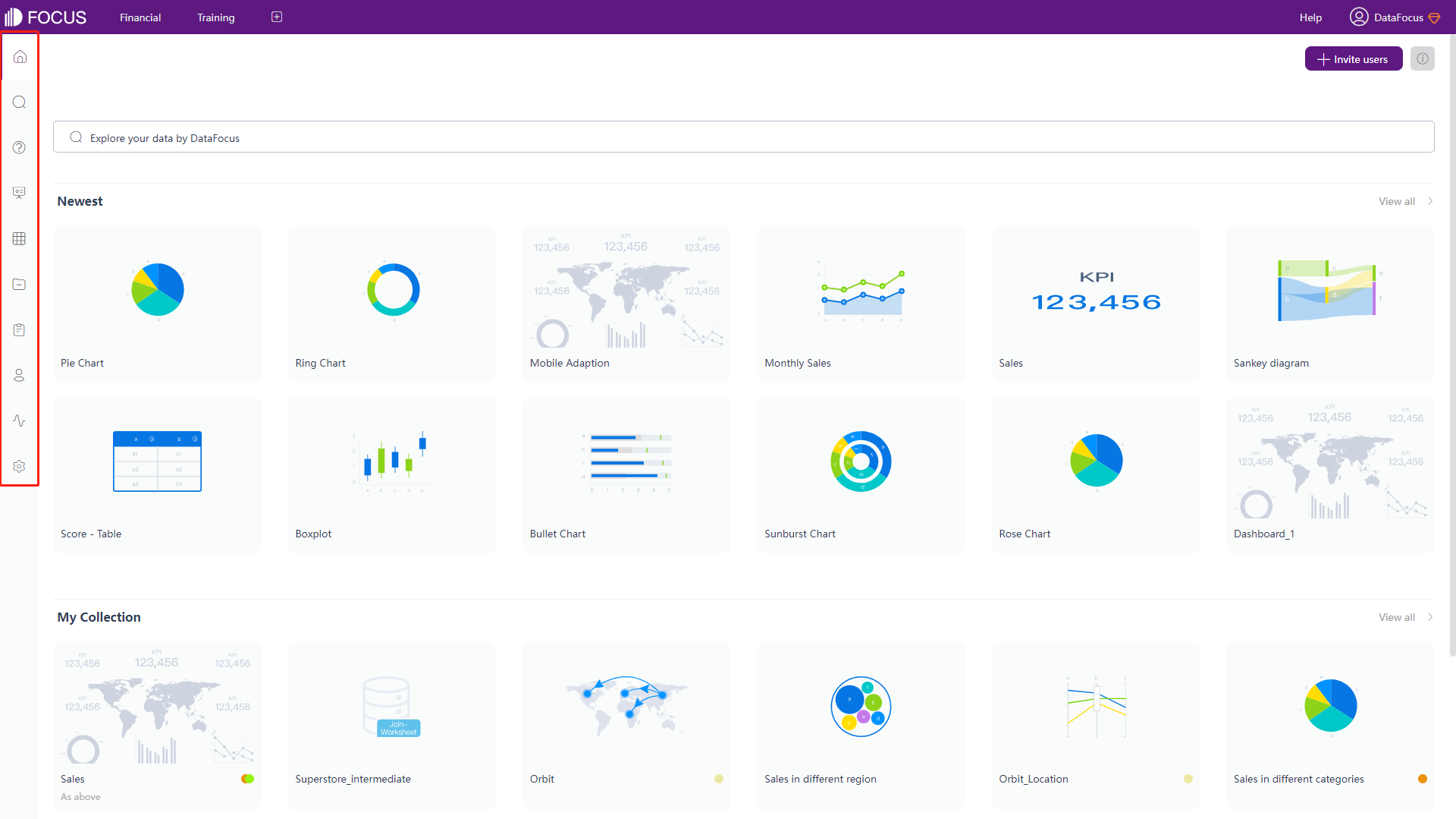
Domo and DFC have 2 navigation bars, both lie on top as well as left of the page. The top ones are both fixed, while the left navigation bar remains the same in DFC, but varies through different modules in Domo.
6 modules arelisted in the top navigation bar of Domo (9 inside “MORE” module), as shown in figure 2-3. While DFC displays 10 modules in the left navigation bar, as shown in figure 2-4. The common modules are dashboards, data, admin, and analyzer/search.
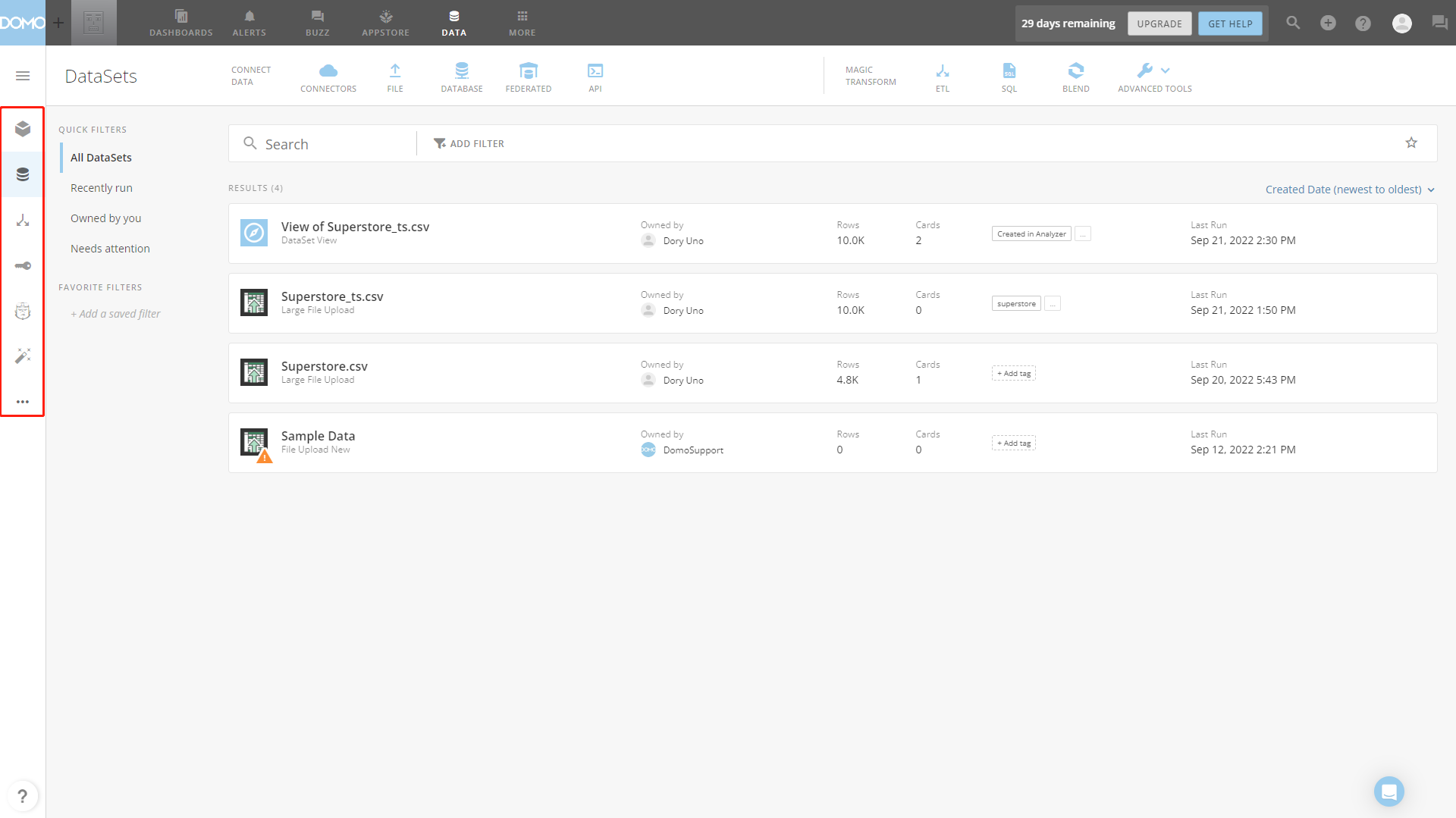
The left navigation bar of Domo is different for each module. For example, in data module, as shown in figure 2-5, it shows data warehouse, datasets, dataflows, etc.
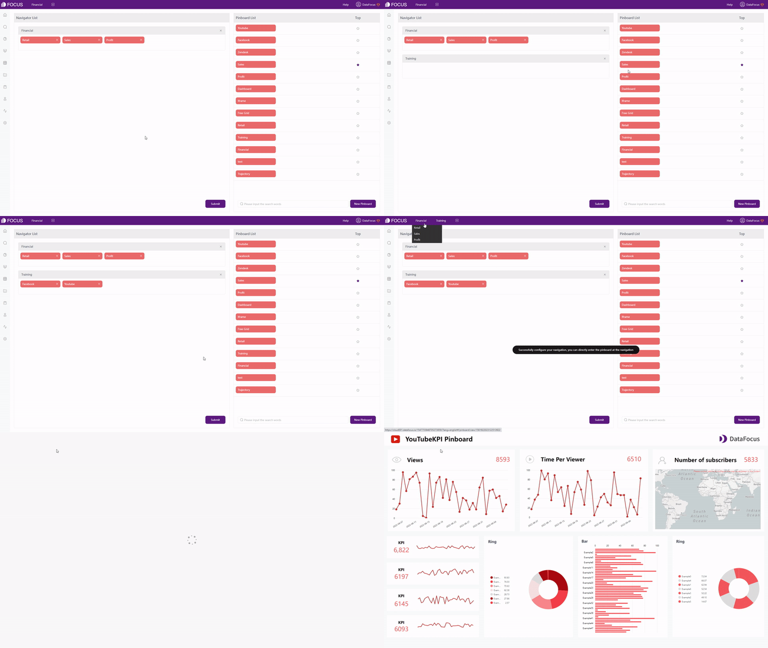
The top navigation bar of DFC mainly exhibits dashboards pinned by users. So that users can get access to these important dashboards at any time they want, as shown in gif figure 2-6. What’s more, the most important one can be used as the system startup page, just light up the asterisk of the relevant dashboard.
2.1.3 Data Page
Data page here refers to the detailed information page of a data table. Users can view relationships/dataflows, dependent resources, and preview data in both Domo and DFC.
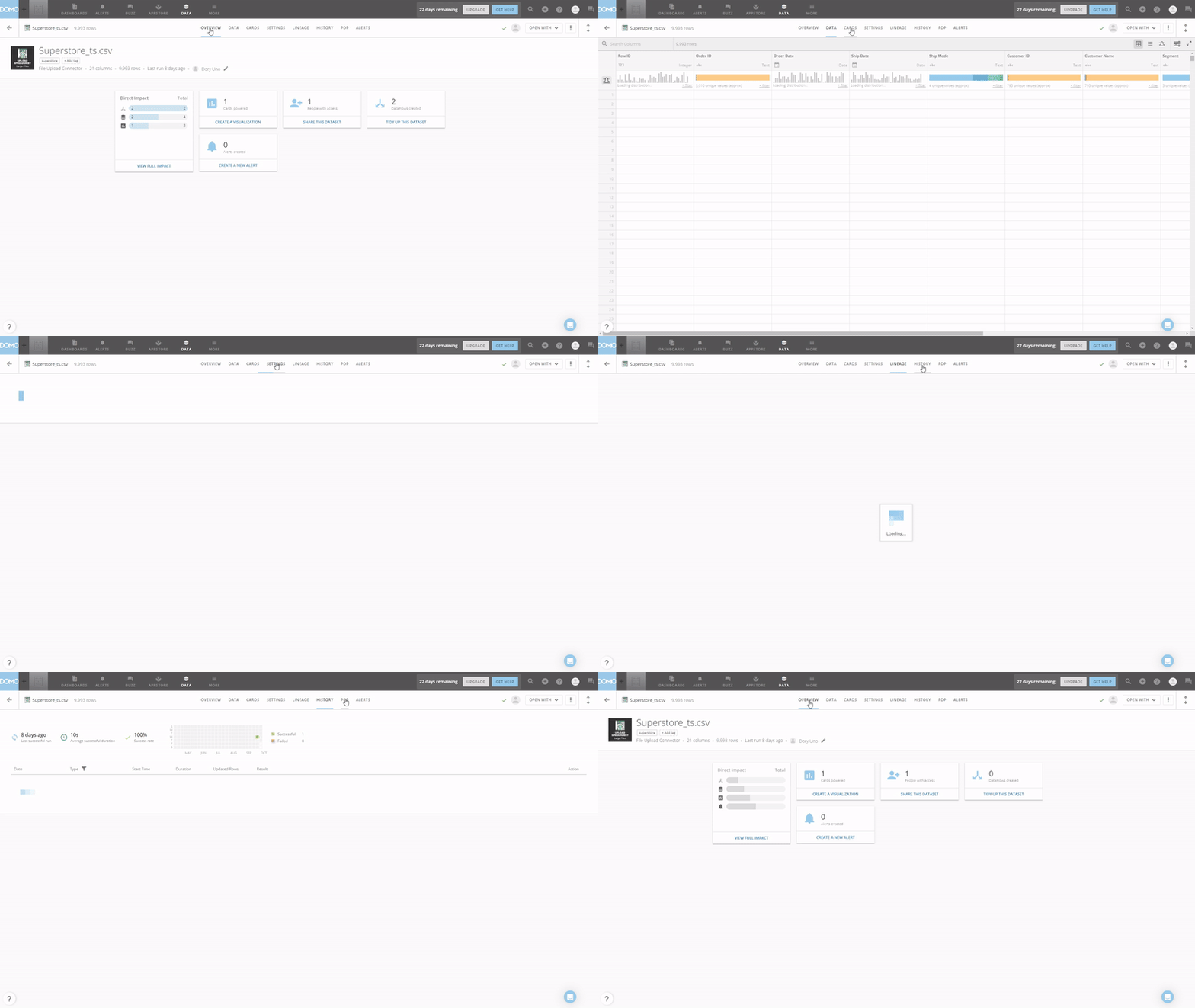
There are 8 parts for Domo, as shown in gif figure 2-7, including overview, data, cards, etc. Note that these pages mainly display information rather than making changes.
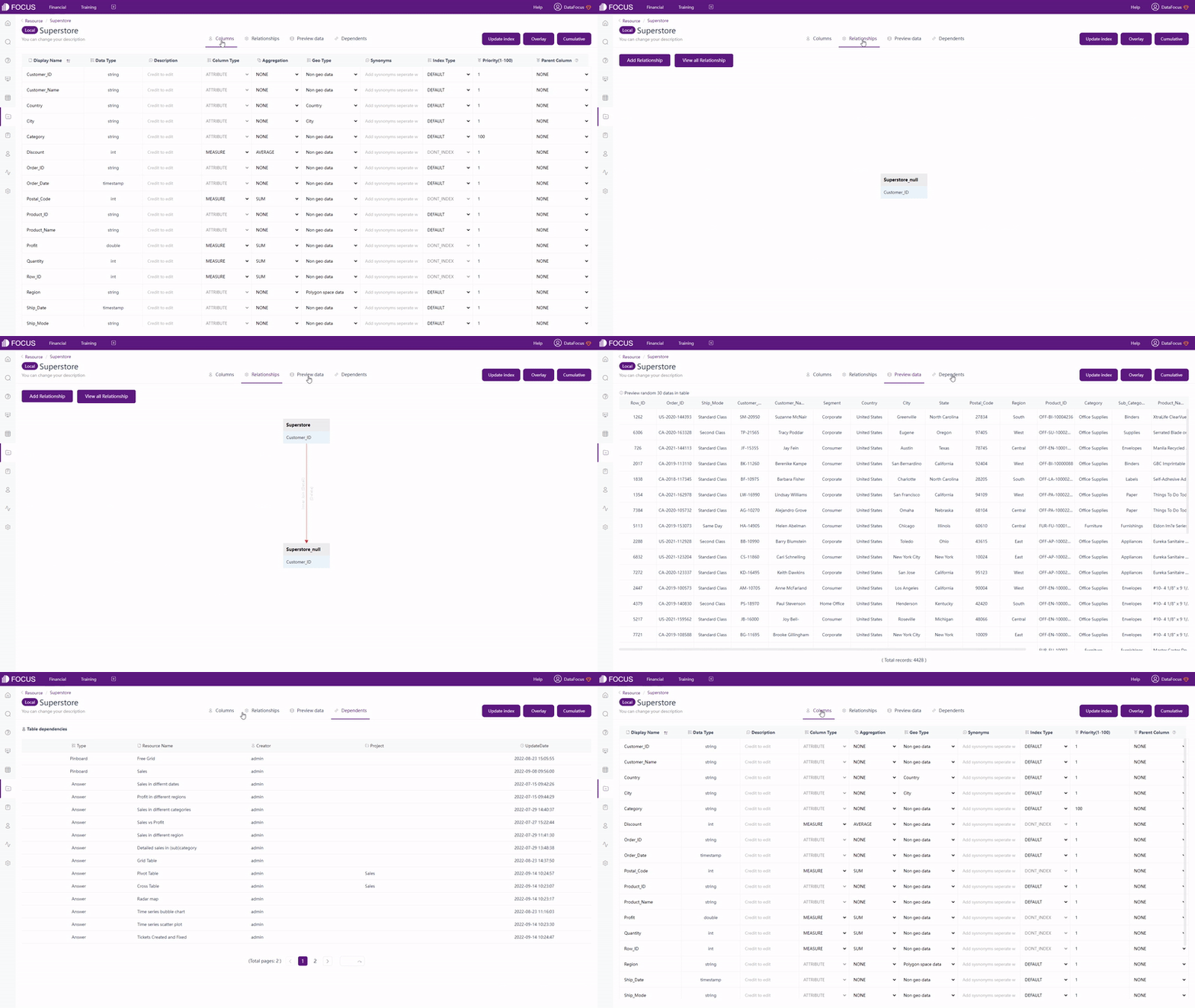
As shown in gif figure 2-8, there are 4 parts in DFC, including column information, relationships, data preview and dependent resources. Changes can be made in these pages, such as alter the aggregation method, geographical type, and nested column (for tree diagram) in “Columns”, add join relationship in “Relationships”, and etc. Also, data can be appended or overlaid here.
2.1.4 Analytics Page
Domo’s analyzer provides dataset view and card (chart) creation. In terms of dataset view, users can add joins/unions, add columns, etc. Also, filters can be added here, and the visualization would change accordingly.
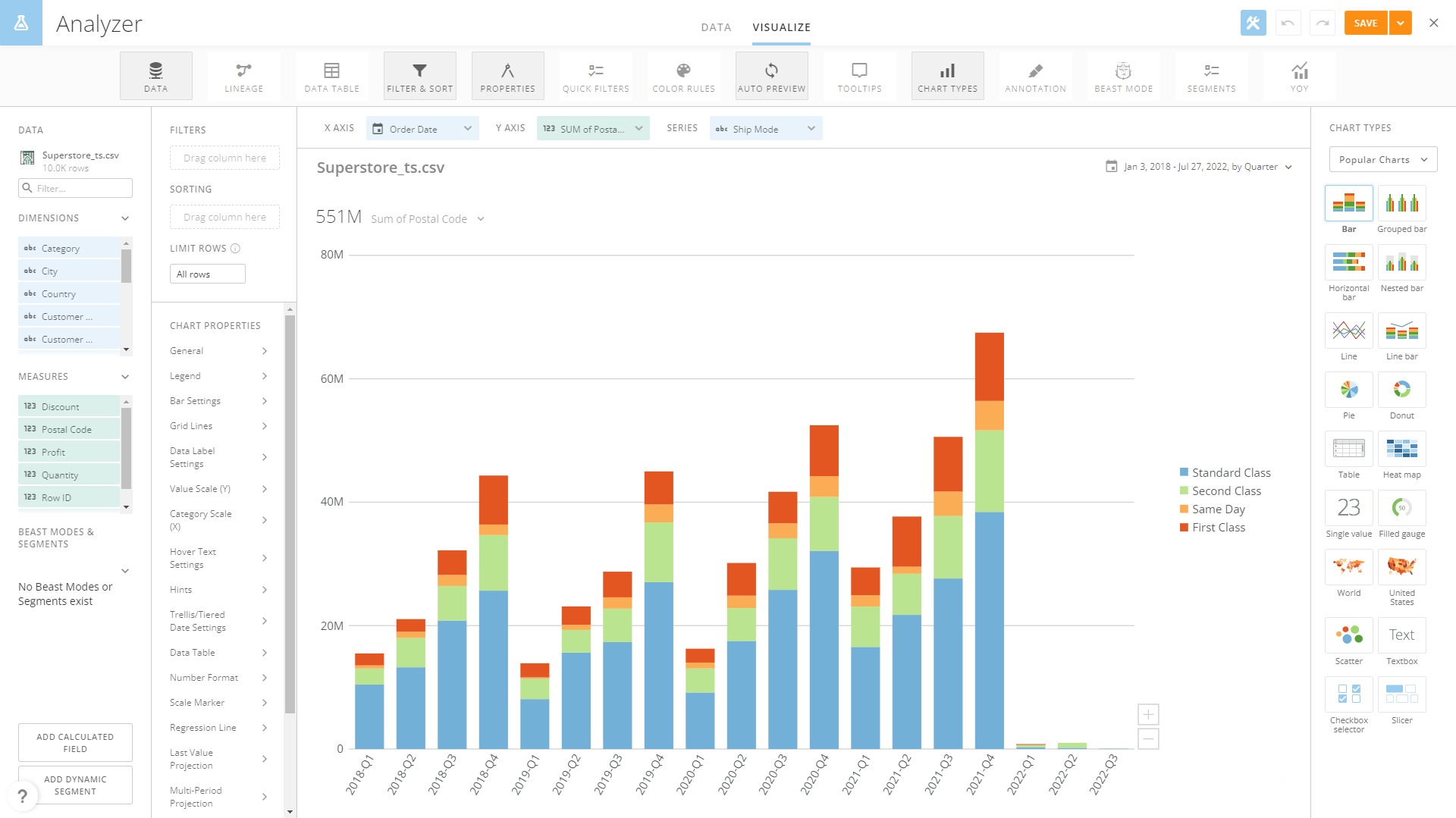
A chart will be automatically created on the canvas. However, the visualization page is a bit crowded, as shown in figure 2-9. Though it provides many different features, new users may find it overwhelming. The canvas is relevantly small, and the space for column names is narrow, resulting frequent scroll when dragging columns. However, users can choose to deselect some features to make the canvas larger, and use filters to search for columns.
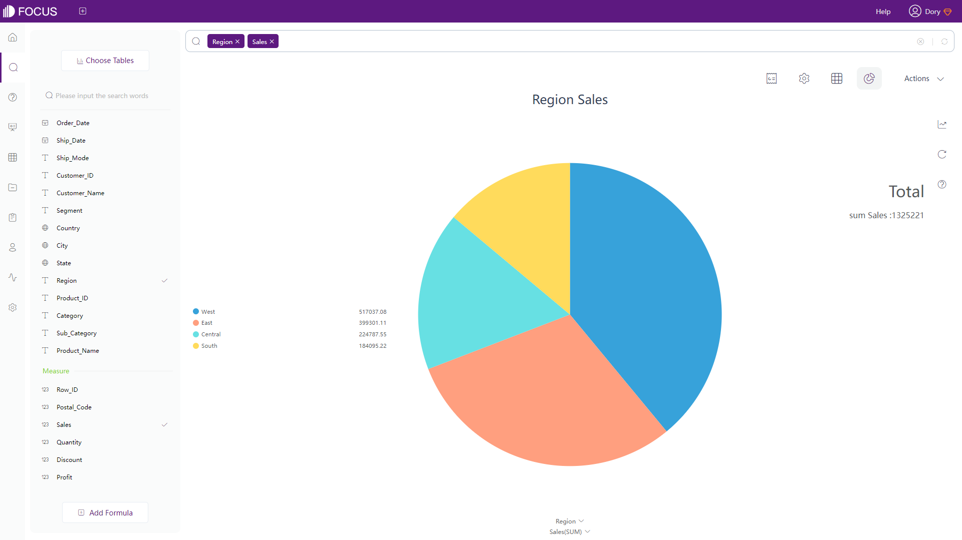
On the search analysis page, there are 3 parts: columns, search bar, and the canvas. Similar to Domo, users can search column names to quickly locate the field. Also, users can add all columns by selecting “Select All”. Different features such as data transfer, chart configuration, etc can be found under different buttons.
2.1.5 Resource Page
-
Resources
Under “Overview” of Dashboard module, all of the Domo cards are listed here, and cards can be shown in four preset sizes as shown in figure 2-11. Also, users can find cards created depending on the data table through “CARDS” page of that table.
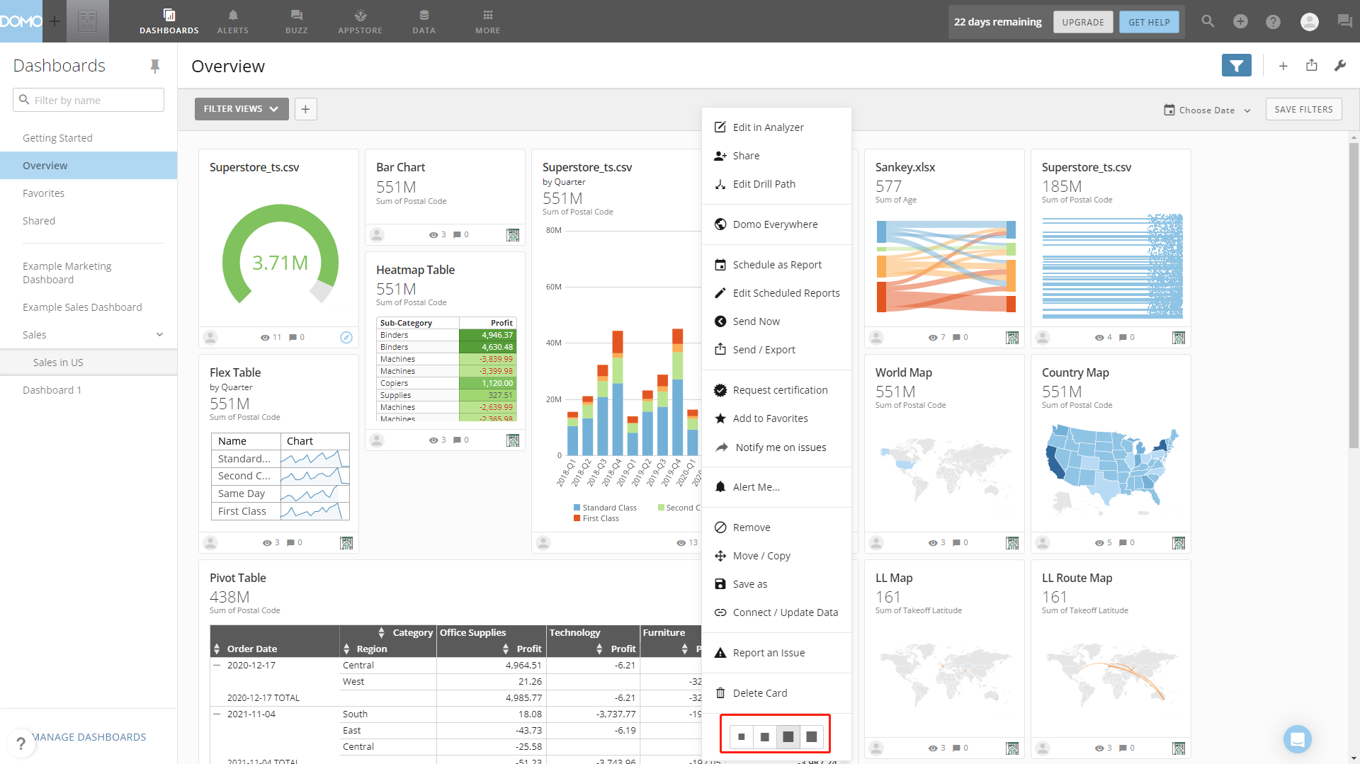
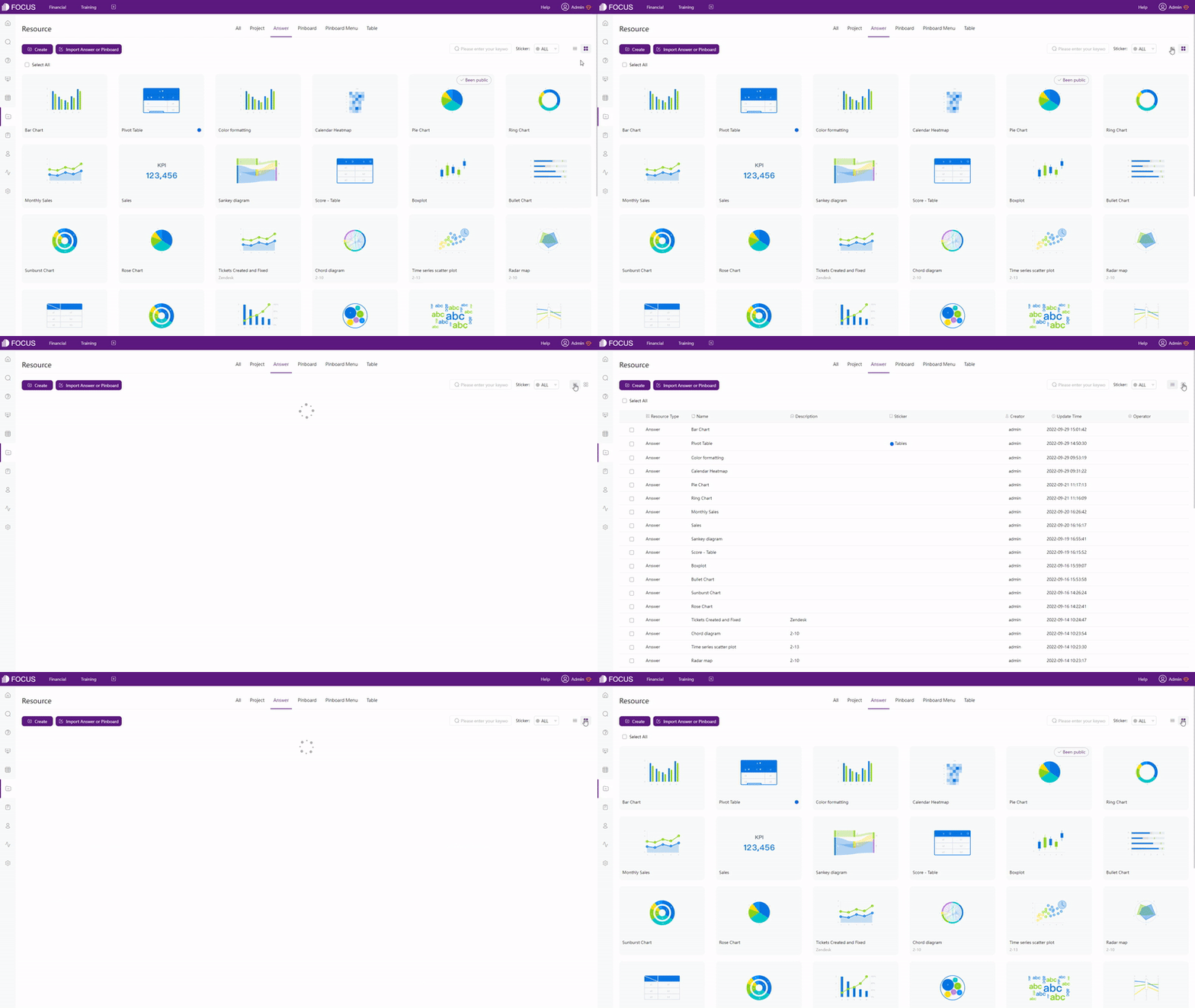
Figure 2-11 Resource page - Domo DFC has a resource module to exhibit all kinds of resources like answers, dashboards, etc. As shown gif figure 2-12, resources in DFC can be displayed in 2 ways: list and thumbnail. Similarly, dependent resources can be viewed on the “Dependents” page of detailed data page.
GIF Figure 2-12 Display modes -
Operations
On the “Overview” page, cards can be shared, sent, saved, etc, as shown in figure 2-13. Also, time filters can be set here.
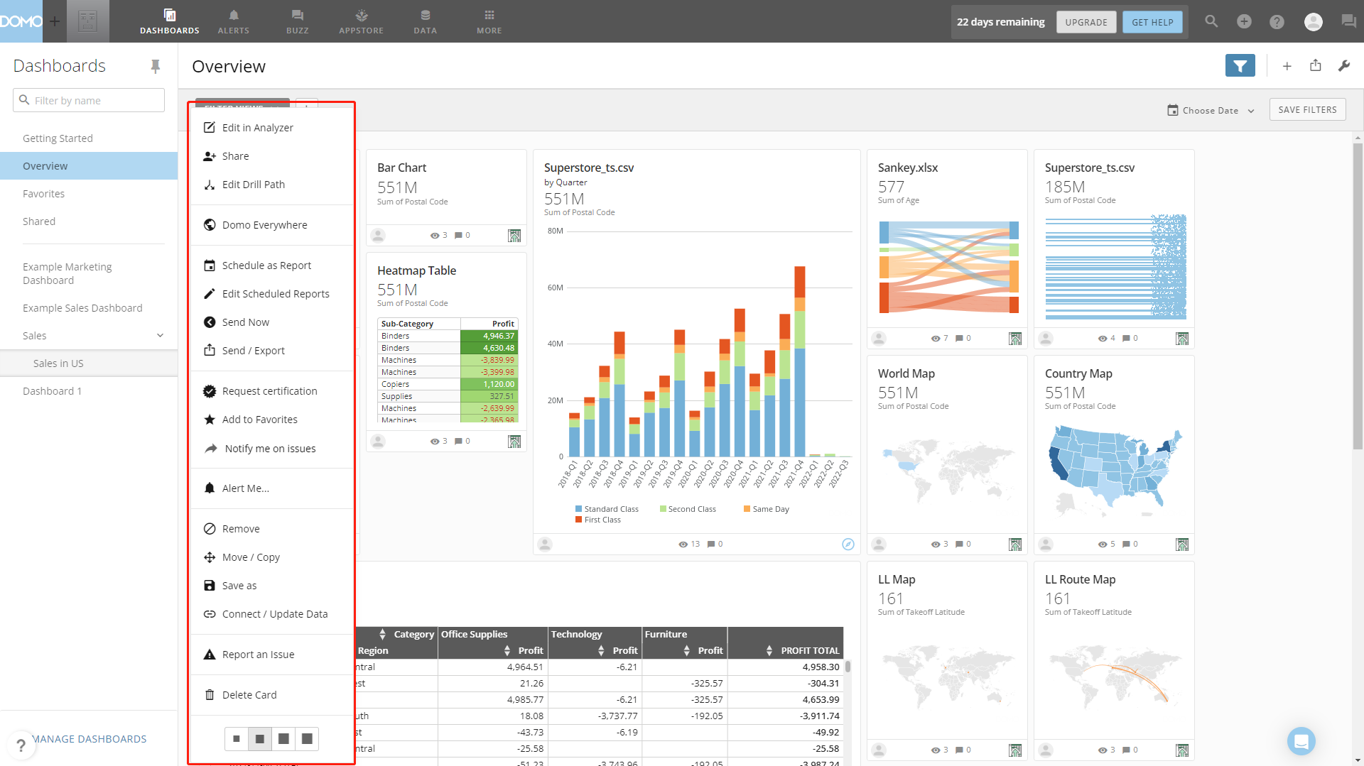
Figure 2-13 Operations - Domo On the resource module of DFC, resources can be moved, deleted, shared, etc., as shown in figure 2-14.
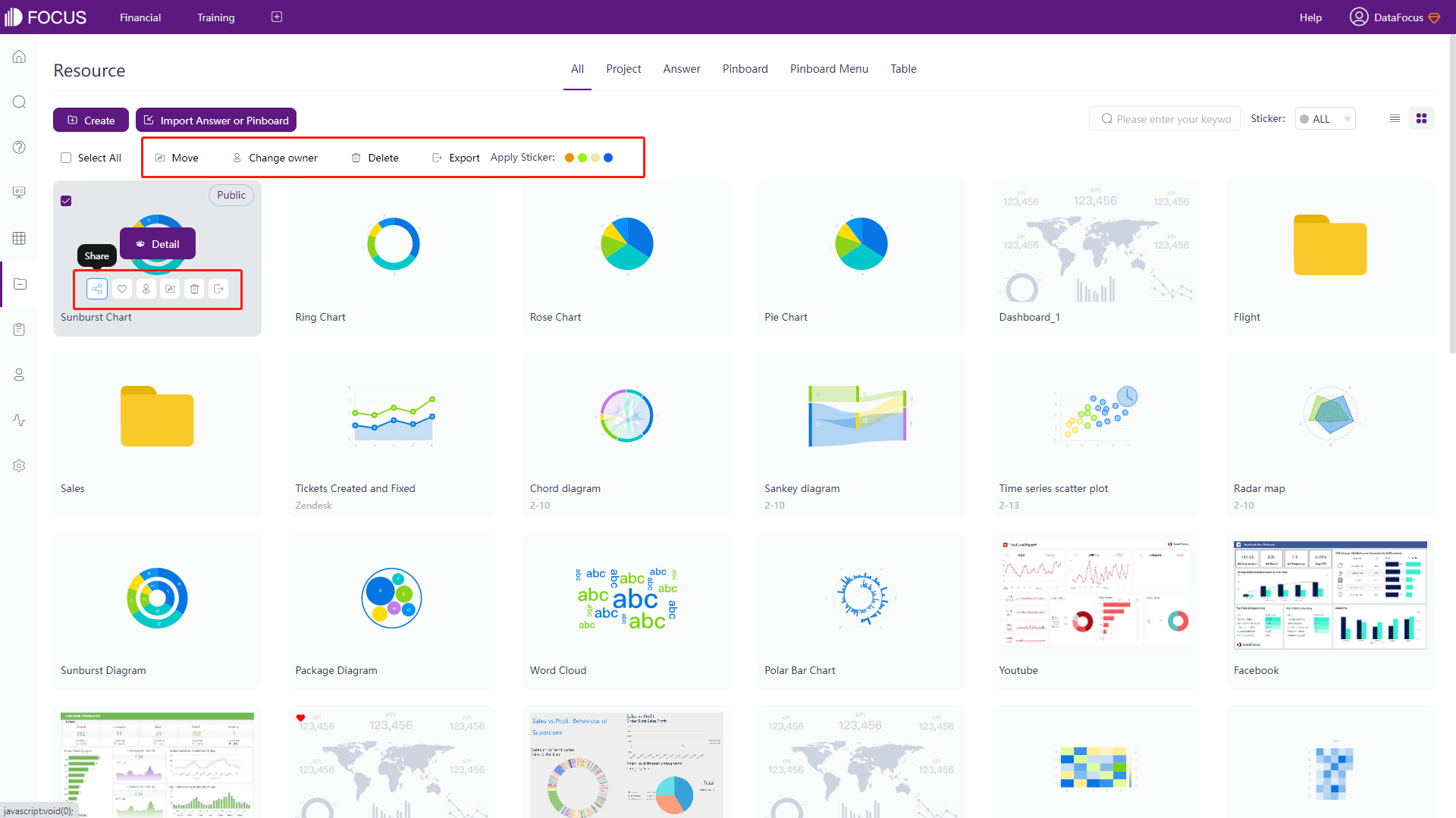
Figure 2-14 Operations - DFC -
Tags
Both Domo and DFC use tags to help manage resources. Domo applies texts while DFC applies texts combined with color dots, as shown in figure 2-15 and gif figure 2-16.
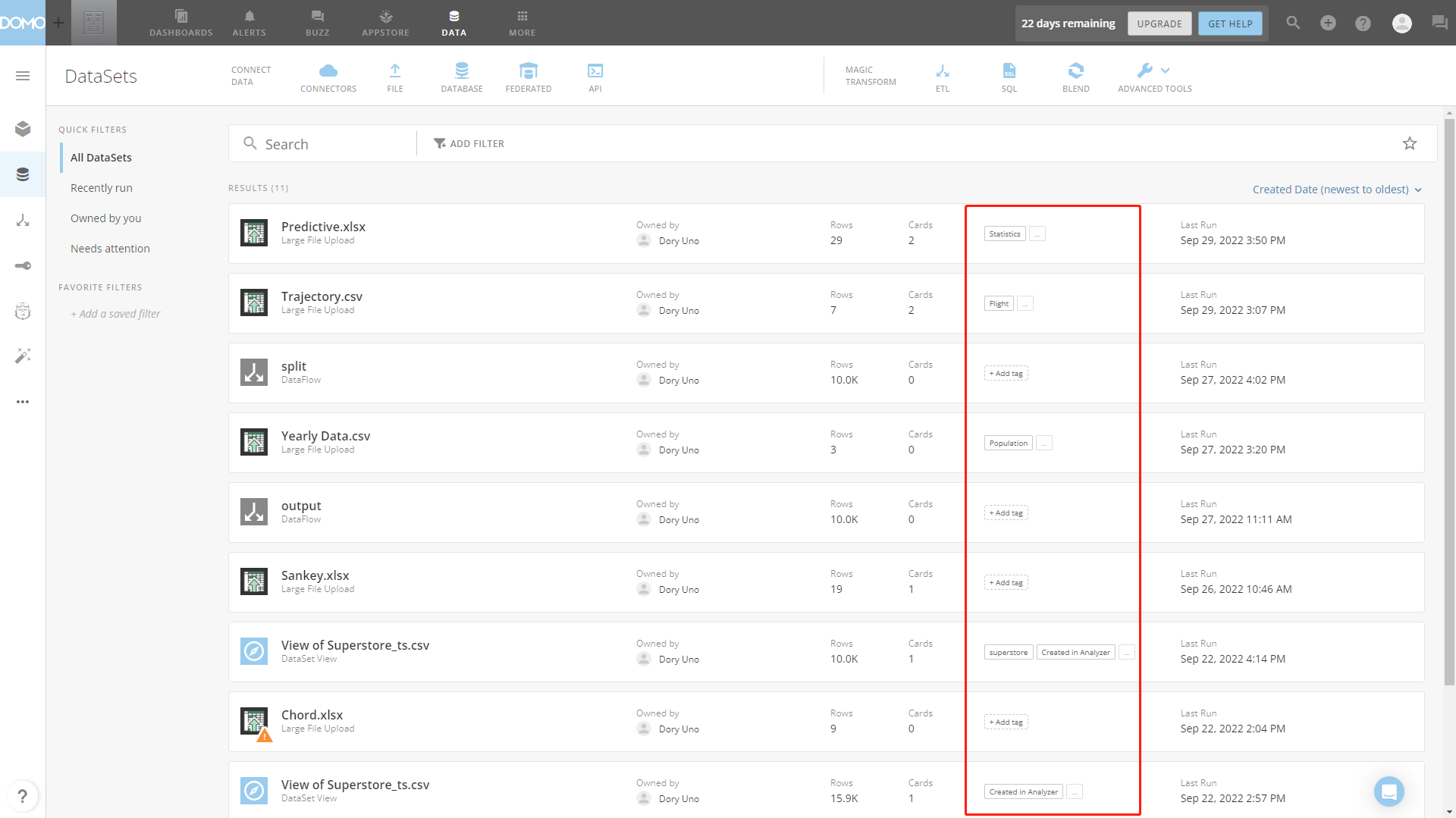
Figure 2-15 Tags - Domo 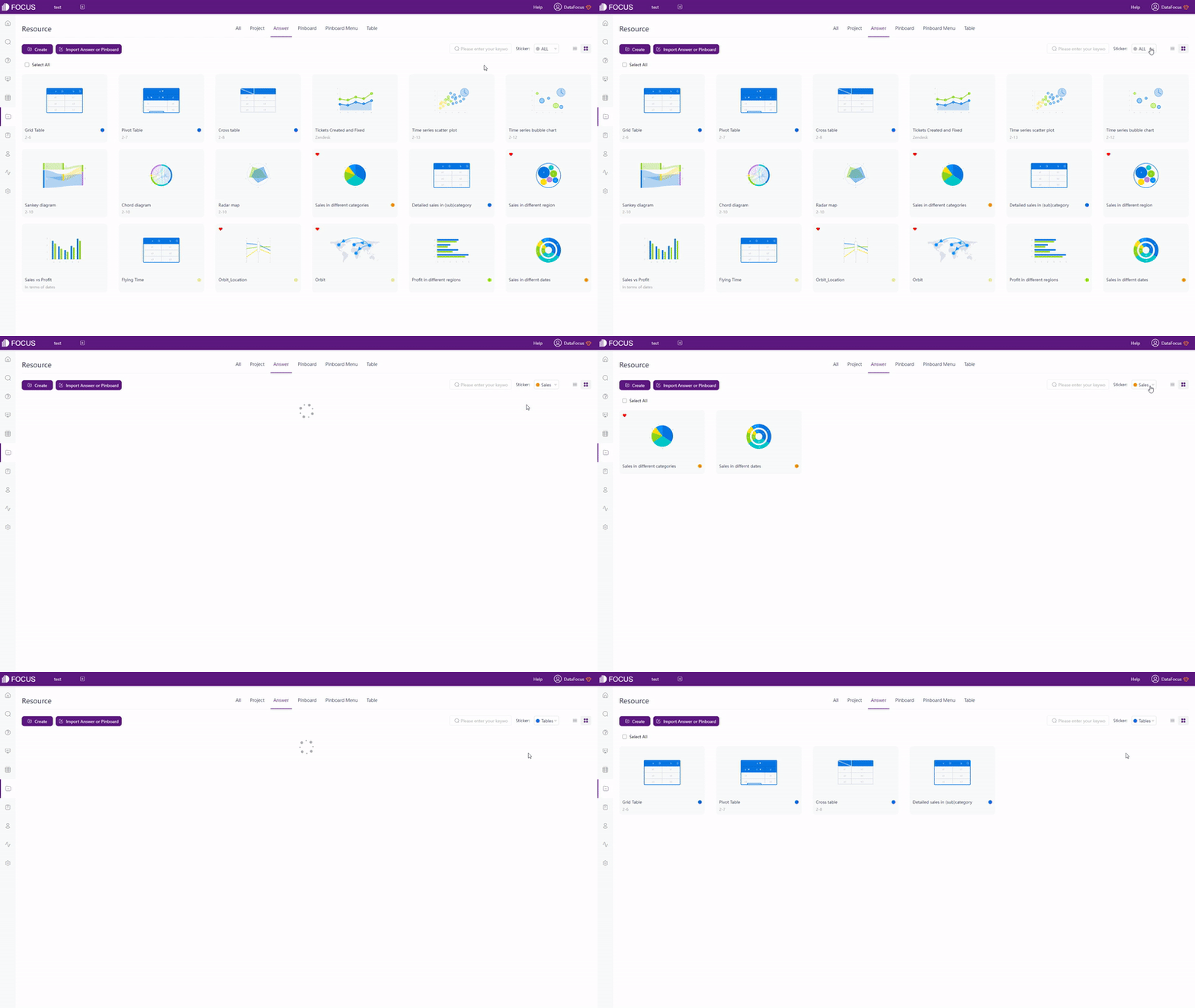
GIF Figure 2-16 Tags - DFC
2.2 Data Source
In the free trial of Domo, users can upload 1 flat data file (CSV) with a limit of 10 M, or connect to cloud data warehouse, such as Snowflake, Amazon Redshift, etc.
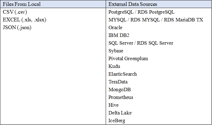
Domo provides a series of data connectors, including cloud, on-premises, file upload, API, federated and proprietary systems connectors. Similarly, DFC also offers file upload, data warehouse upload, database connection and API connection. In terms of data base connection, DFC used as a data warehouse, and multiple databases can be connected at the same time to realize join-analysis.
Data sources supported by DFC:
2.3 Ease of Use
2.3.1 Interaction Mode
Domo uses drag-and-drop as the interaction mode, while DFC applies search-based analysis. The former one would make users focus more on how to create a beautiful visualization while the latter one could make users focus more on what to analyze. To make a advanced chart, drag-and-drop method may take a longer time than search analytics. Here is an example showing a relevantly complicated search in DFC.
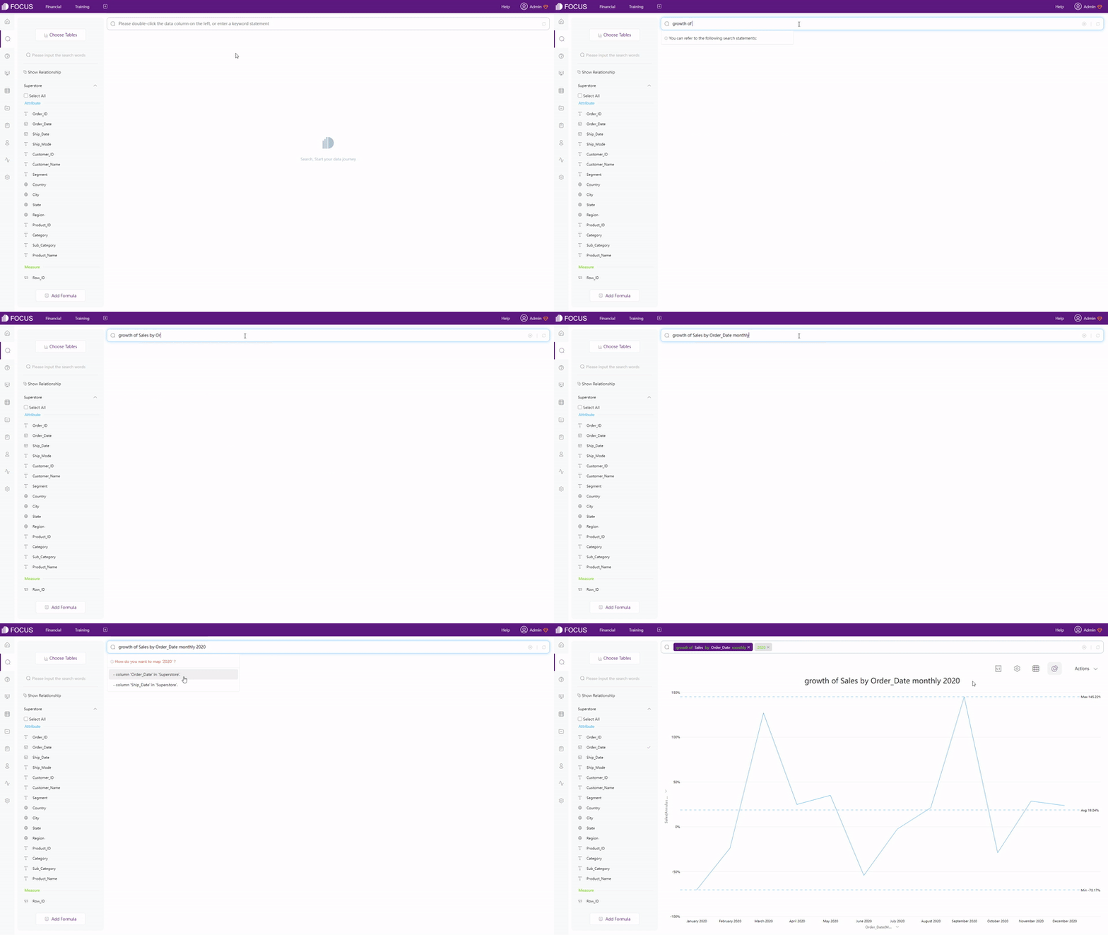
The search-based analytics makes “what you think is what you get” possible and turns business questions directly into data analysis. As shown above, business data analytics can be quickly accomplished and the values of data can be executed through a simple exploration. It is a immediately feasible way to deal with business questions and make decisions.
2.3.2 Filter
Domo provides many filters throughout the system, from card-level to page-level. Card-level filters can be applied to a chart when creating a card or afterwards, and page-level filters can be applied to a dashboard. Quick filter is a card-level filter that is added to the card as a filter pane, and filter view is a page-level filter that can be customized to satisfy every users’ needs.
Instead of having different kinds of filters, DFC provides different ways to add filters.
-
Keywords
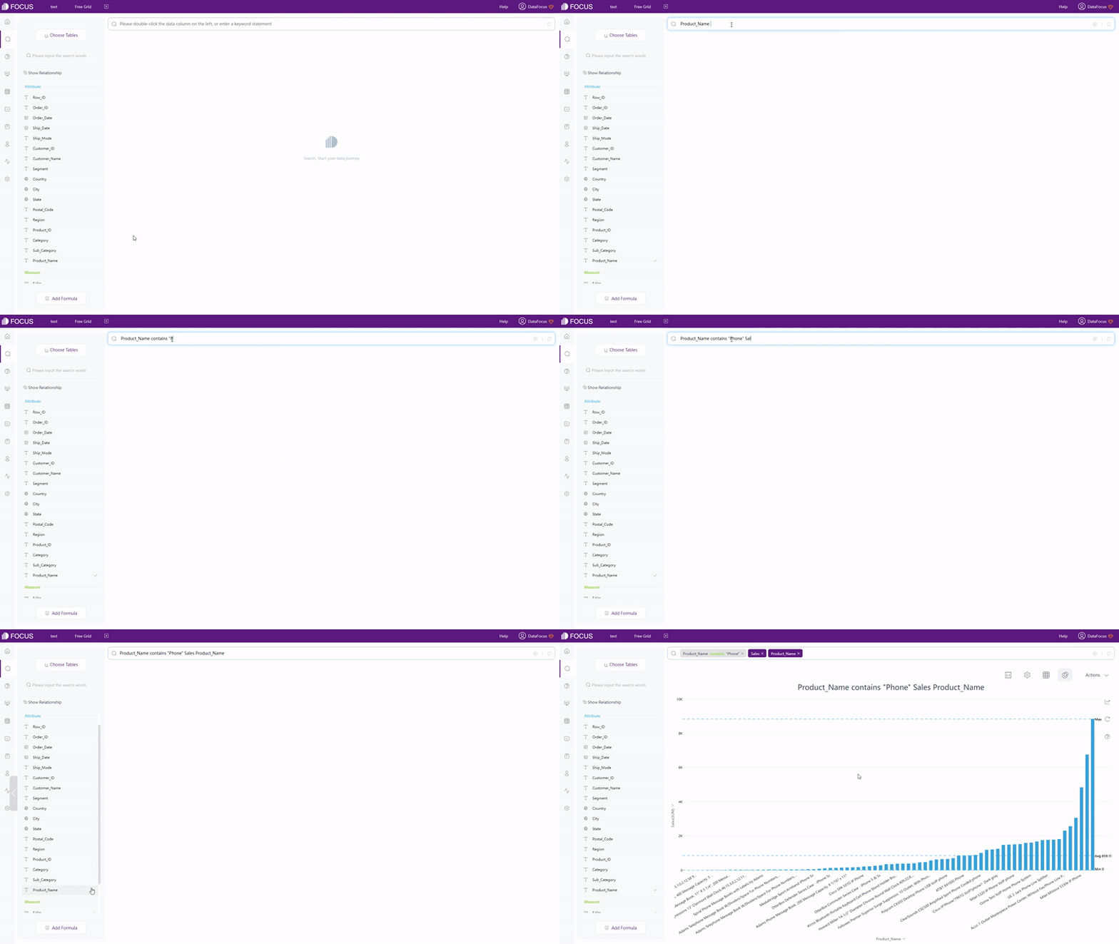
Keywords are actually a form of filter. By entering keywords on the search bar, data can be selected, as shown in gif figure 2-19. The entire list of (filter) keywords can be viewed here: Keywords.
GIF Figure 2-19 Keywords -
Filters
(1) Filter on Table
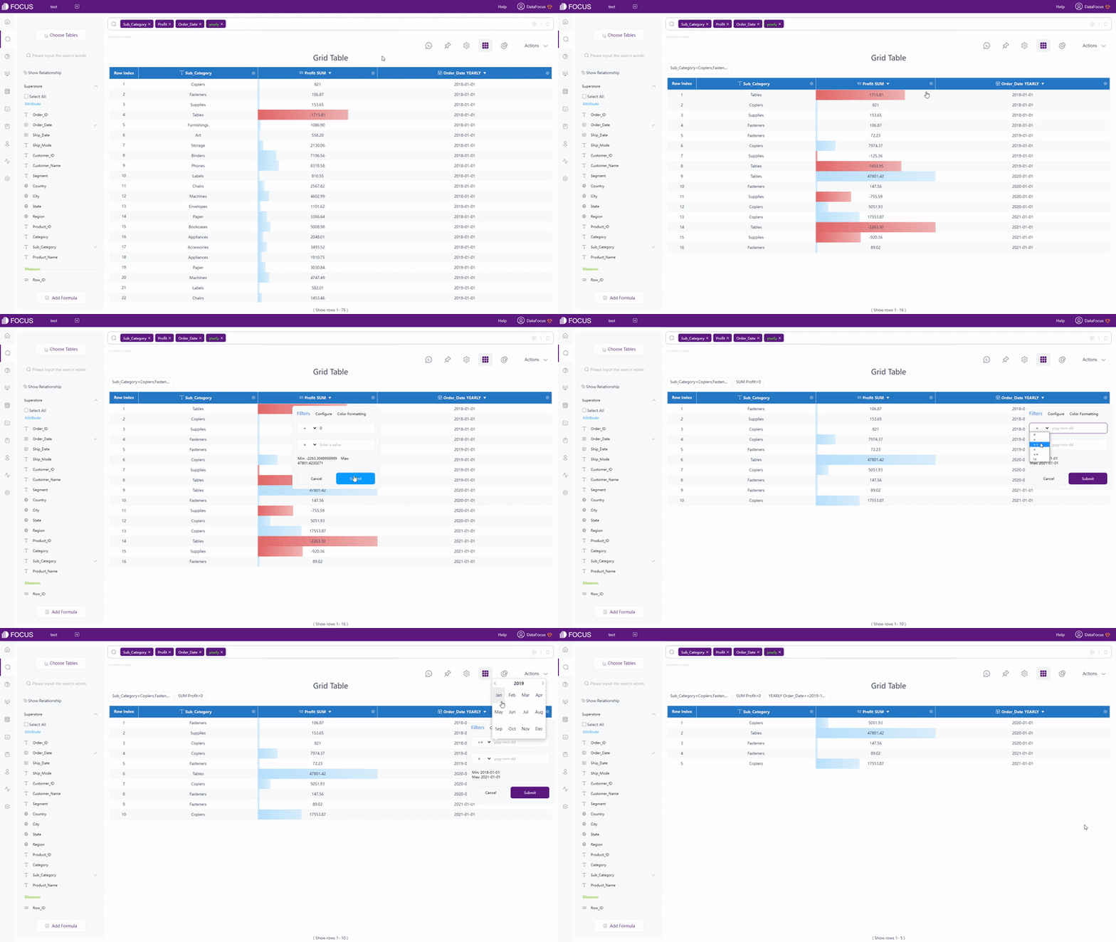
As shown in gif figure 2-20, though the setting button, filters can be added for grid table and pivot table. For non-time Attribute columns, users can add filters in batches.
GIF Figure 2-20 Filter - tables (2) Filter on Graphic
As shown in gif figure 2-21, users can add filters (in batch) onthe axes.
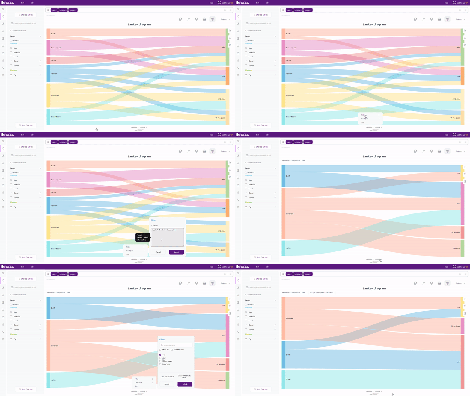
GIF Figure 2-21 Filter - graphics (3) Filter on Dashboard
Visualizations in the same dashboard can be filtered together by selecting a data point or an data area, as shown in gif figure 2-22. If users want to remove the filter effect, they can click the “Revert” button.

GIF Figure 2-22 Filter - dashboards
2.3.3 Formula
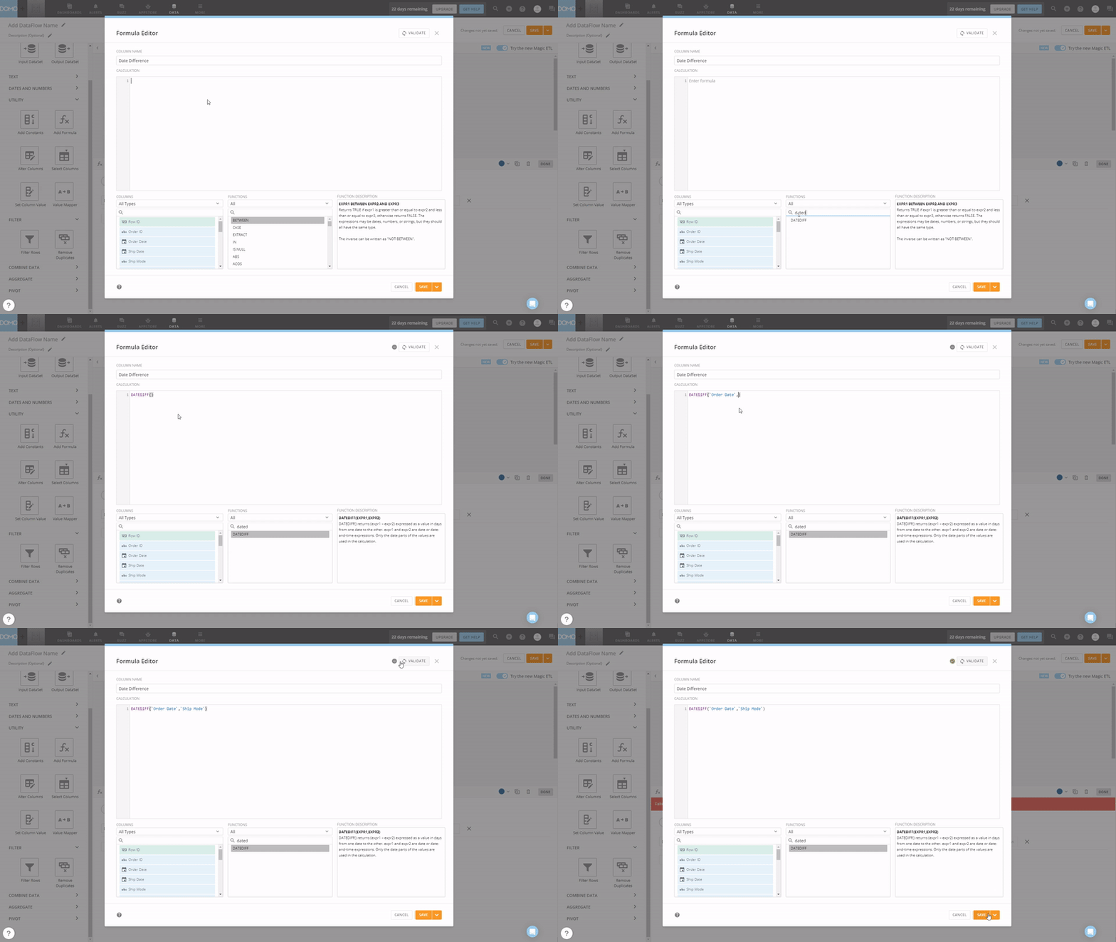
Domo uses “Magic ETL” to process data, and formula is a part of it. The formula editor provides column names, function names, function descriptions, and prompts to help write formulas, as shown in gif figure 2-23. Users can verify the form of the formula by clicking the “VALIDATE” button, though it may take some time. Also, except the common formulas like string, math, time, Domo also has some statistical as well as financial formulas.
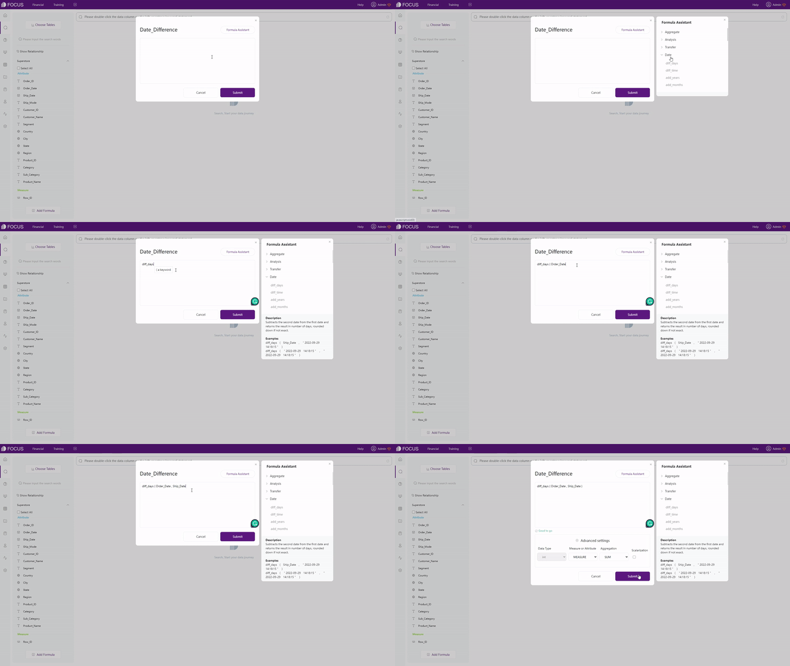
In DFC, there are two ways to add formulas. One is directly typing in the search bar, which is convenient when the formula is easy. Another is using the formula editor, similar to Domo, it also provides assistants such as formula description and prompts. What’s more, DFC’s formula editor also has examples for each formula as well as prompts giving information about syntax, and the validation is automatic. Other than common formula types, DFC also has transfer functions, group analysis functions, and JSON functions, the full formula list can be viewed here: Formula List.
2.4 Data Processing
Domo has many tools under “MAGIC TRANSFORM” to do data processing, and “Magic ETL” is mainly introduced here. Note that “Magic ETL” also has a drag-and-drop interaction mode.
The data process functions in DFC are mainly separated within table module and search analysis module.
The comparison is shown below:
-
Relate Tables
Both Domo and DFC support combine data from different datasets and join data tables. Domo uses “Select Columns” and “Join Data” to relate tables, while DFC uses intermediate table and join editor to relate table. Below shows how to join tables in Domo and DFC.

GIF Figure 2-25 Join tables - Domo 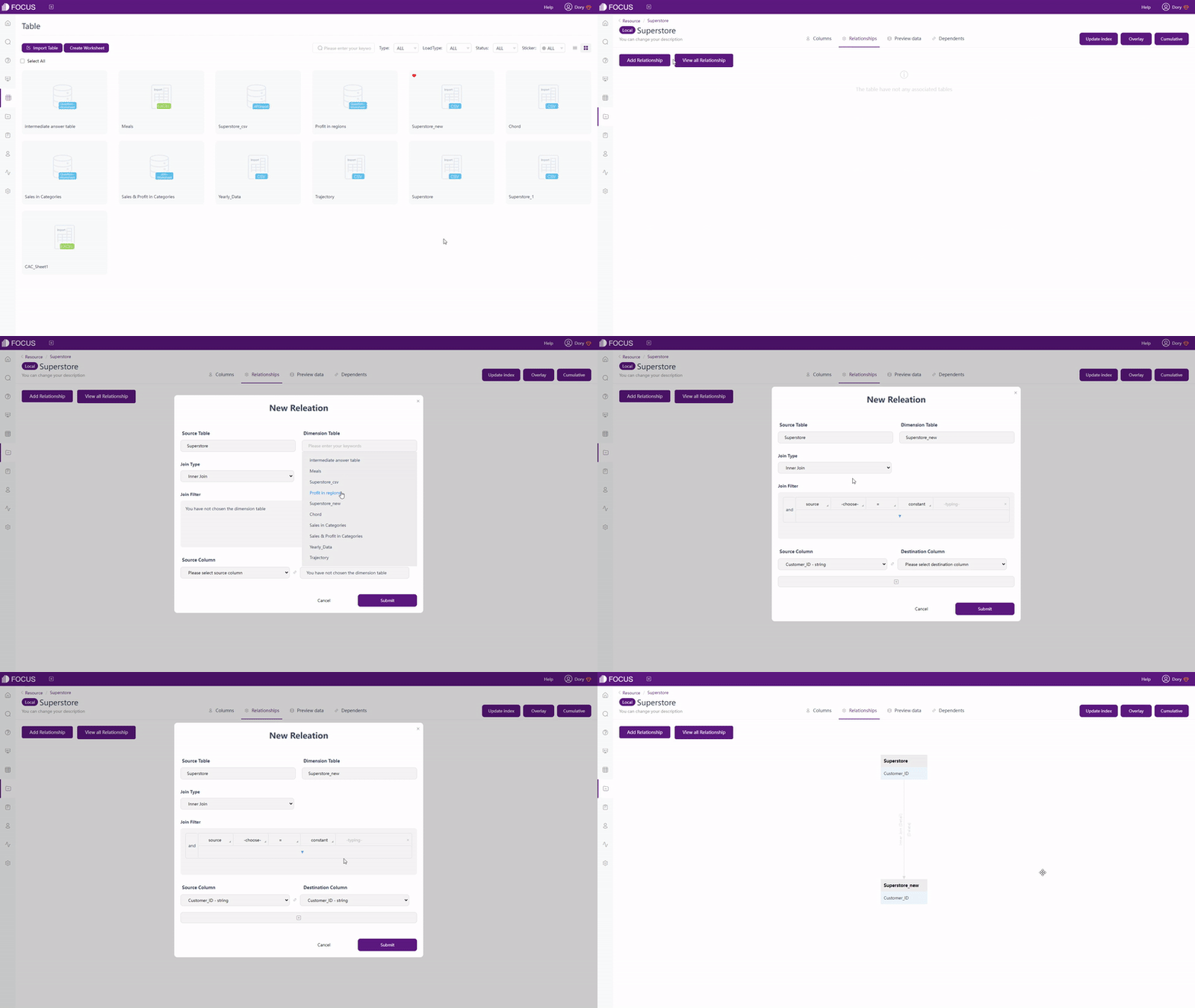
GIF Figure 2-26 Join tables - DFC -
Clean Data
“Magic ETL” of Domo provides removing duplicates, add filters, and many others options to clean data. While DFC uses intermediate tables to clean data, where users can filter, merge, delete data, and etc. There are two different kinds of intermediate tables in DFC, find out more here.
-
Conversion between Rows & Columns
Conversion between Rows and Columns is accomplished by “Pivot” function in Domo, while it is separated into 2 kinds of types of data transfer in DFC. However, Domo has a more strict requirement for the data structure.
Take conversion from columns to rows as an example, Domo transfers different values in the same column into rows, and DFC can transfer values from the same column or different columns.

Figure 2-27 Domo - pivot 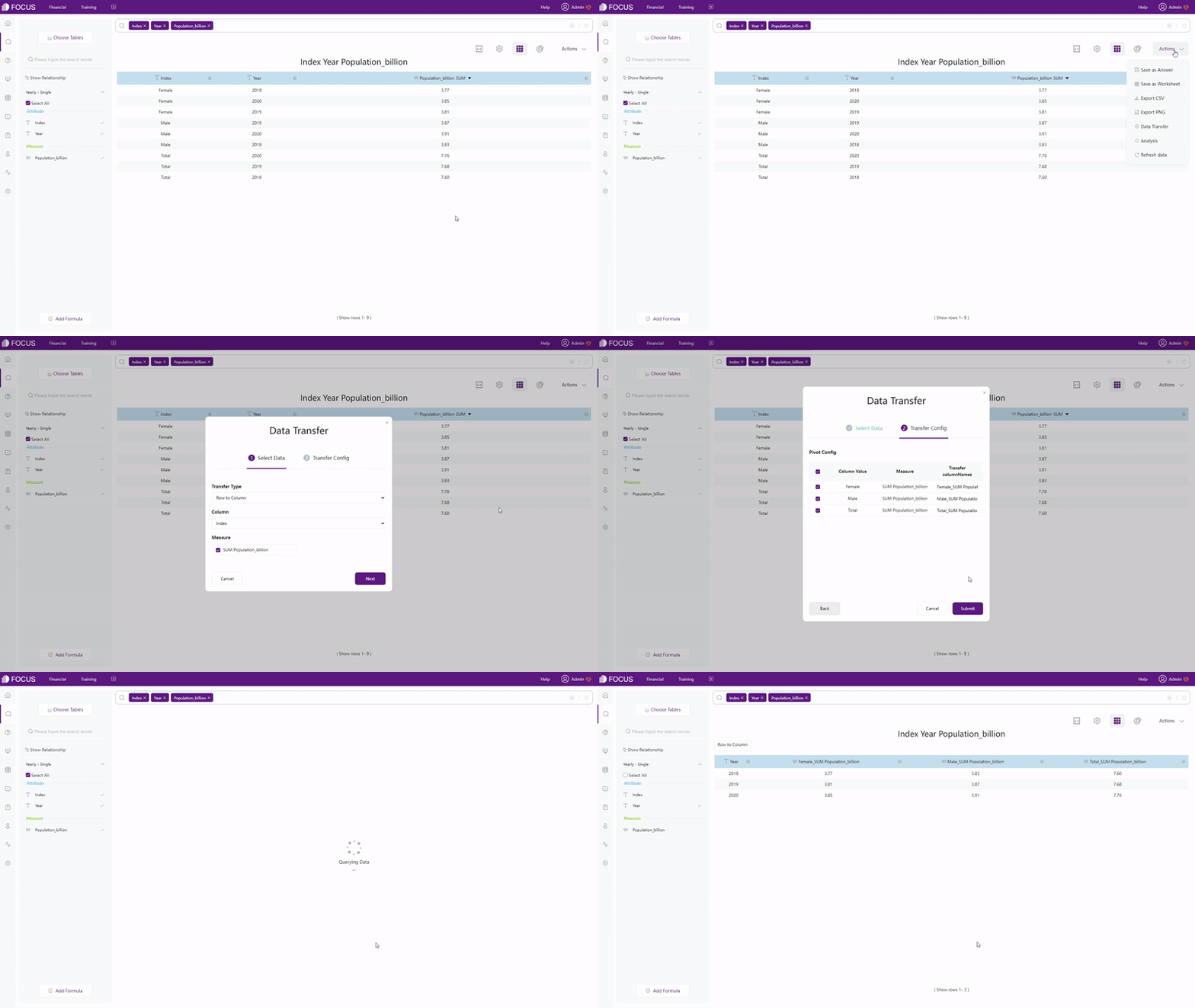
GIF Figure 2-28 DFC - conversion - same column 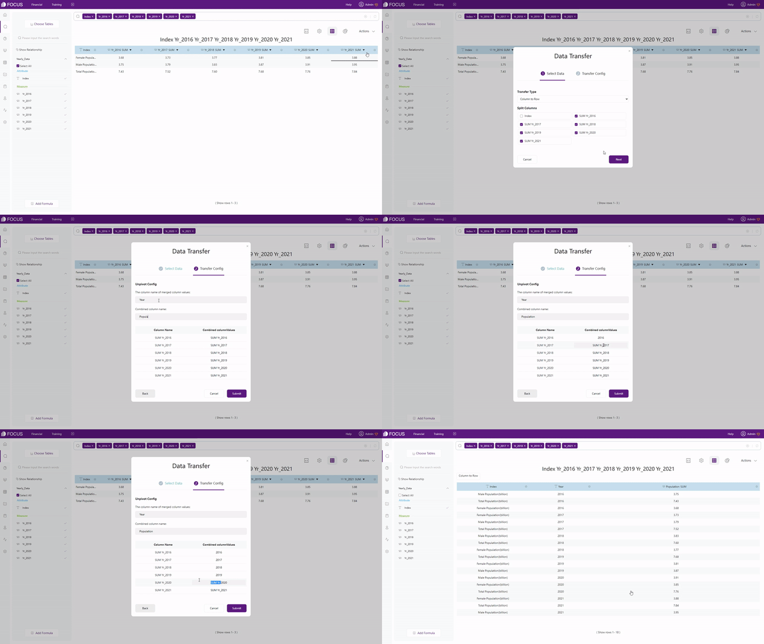
GIF Figure 2-29 DFC - conversion - different columns -
Split Columns
Similarly, Domo uses “Split Column” under “TEXT” part and DFC uses “Column Split” under the “Data Transfer” button. The interface of DFC is simpler, and users can select the split number themself to choose how many columns to split into.

Figure 2-30 Split columns - Domo 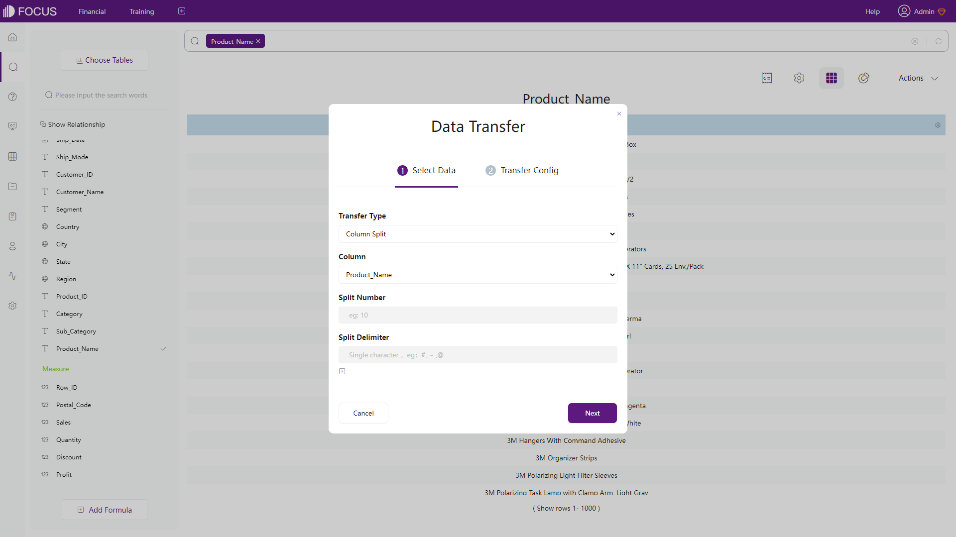
Figure 2-31 Split columns - DFC
Domo’s “Magic ETL” provides a series of functions to do data processing. Though the intermediate table of DFC can accomplish part of the functions, it is less stronger. However, DFC’s DataSpring is coming with much stronger data processing functions.
2.5 Visualization
2.5.1 Table
-
Table types
Domo has 5 types of tables: HTML table, heatmap table, mega table, flex table and pivot table, while DFC provides 3 different types of tables: grid table, pivot table, and cross table.
-
Common Tables
Domo: HTML table, heatmap table, and mega table have a same structure, the difference is that heatmap table displays data in a heatmap color mode and mega table can include up to 25000 rows of data. Below is the heatmap table.
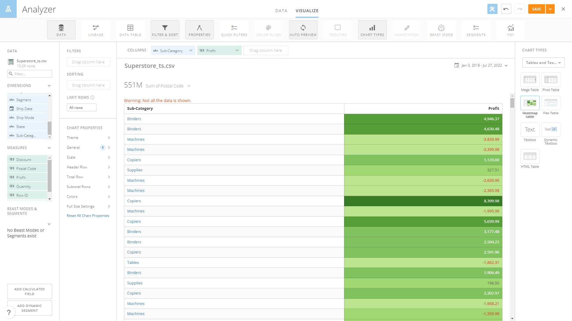
Figure 2-32 Heatmap table - Domo DFC provides grid table to show data in a two-dimensional structure and the heatmap mode can be set.
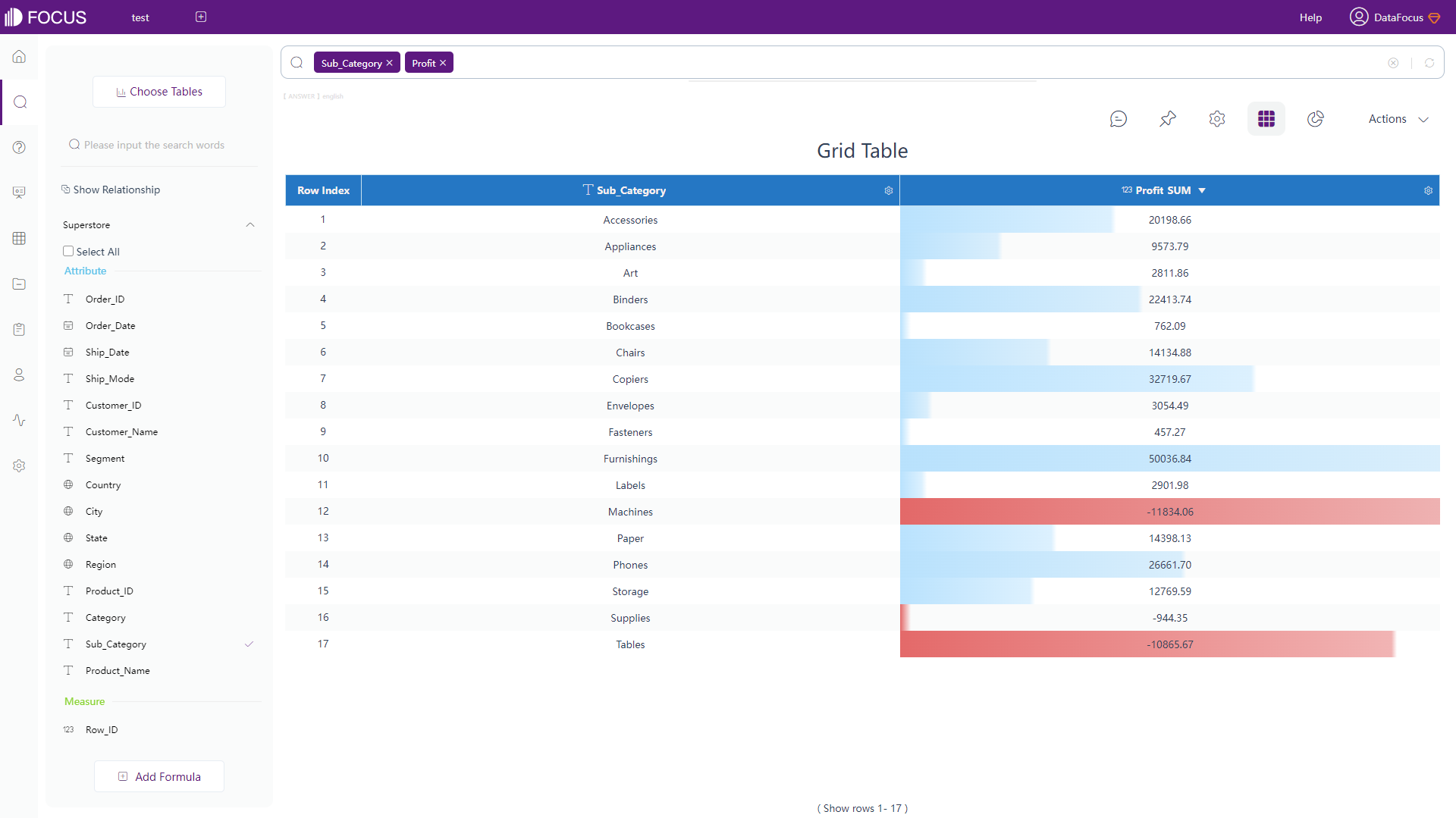
Figure 2-33 Grid table - DFC -
Pivot Tables
Pivot table exhibits data in a tree structure, and both Domo and DFC provide this table type.
Also, users can set the heatmap mode of pivot table in DFC.
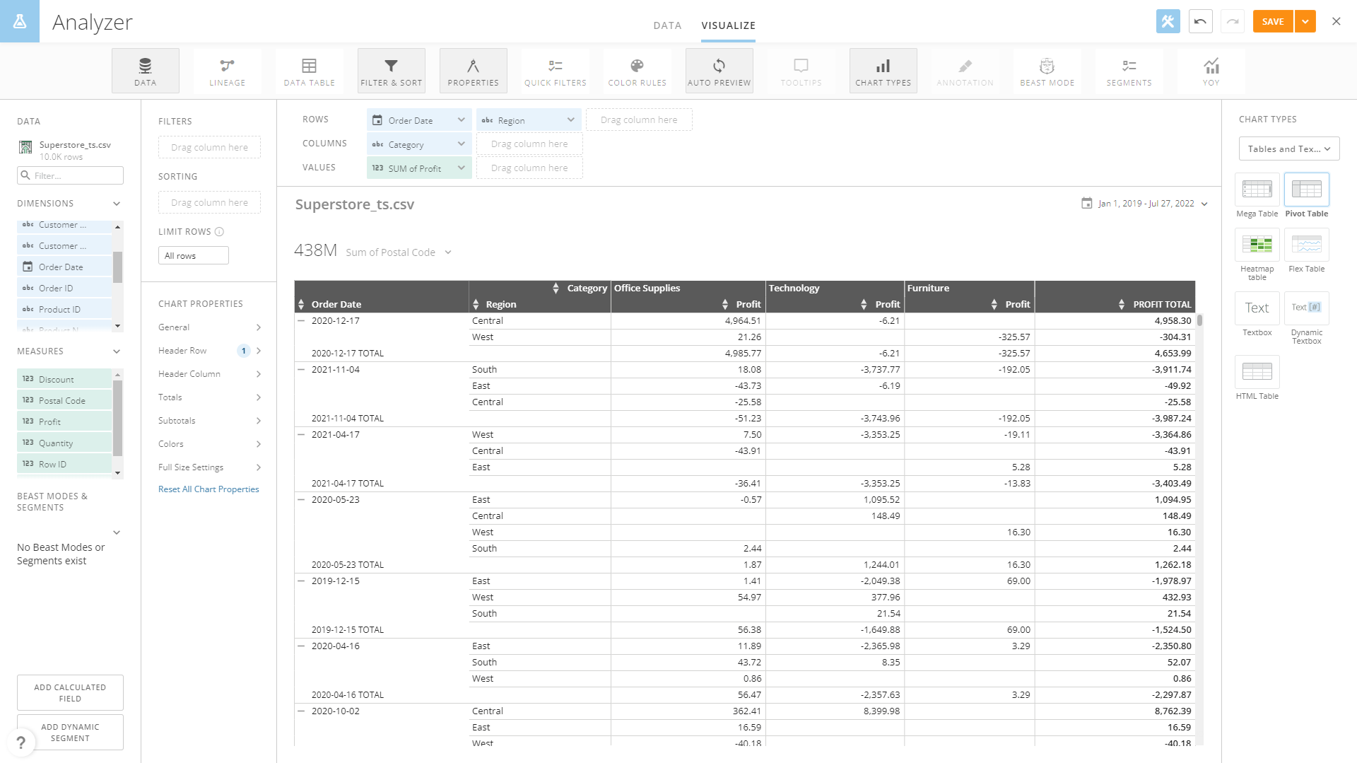
Figure 2-34 Pivot table - Domo 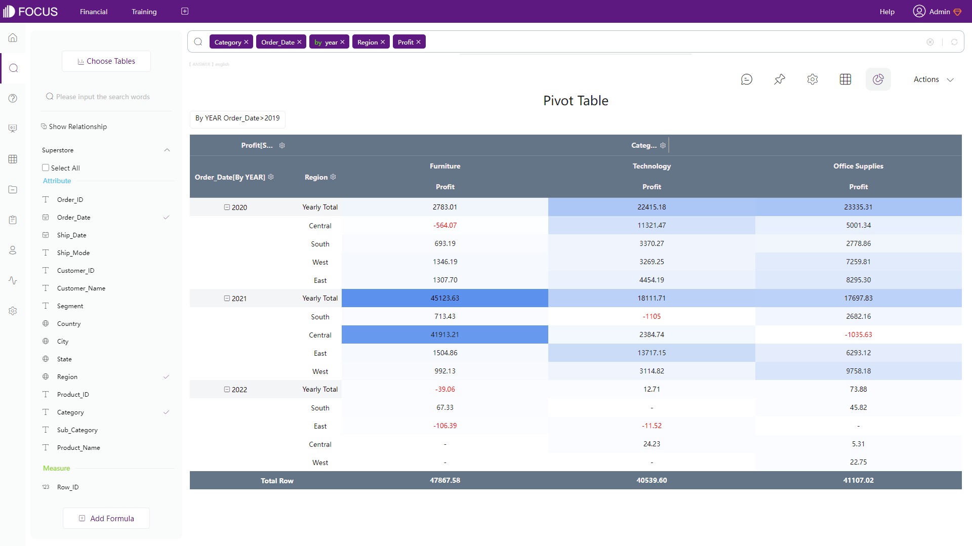
Figure 2-35 Pivot table - DFC -
Unique Tables
Domo: Flex table is useful for displaying the overall trends.

Figure 2-36 Flex table - Domo DFC: Cross table uses multi-dimensional structure and meets various complex business demand.
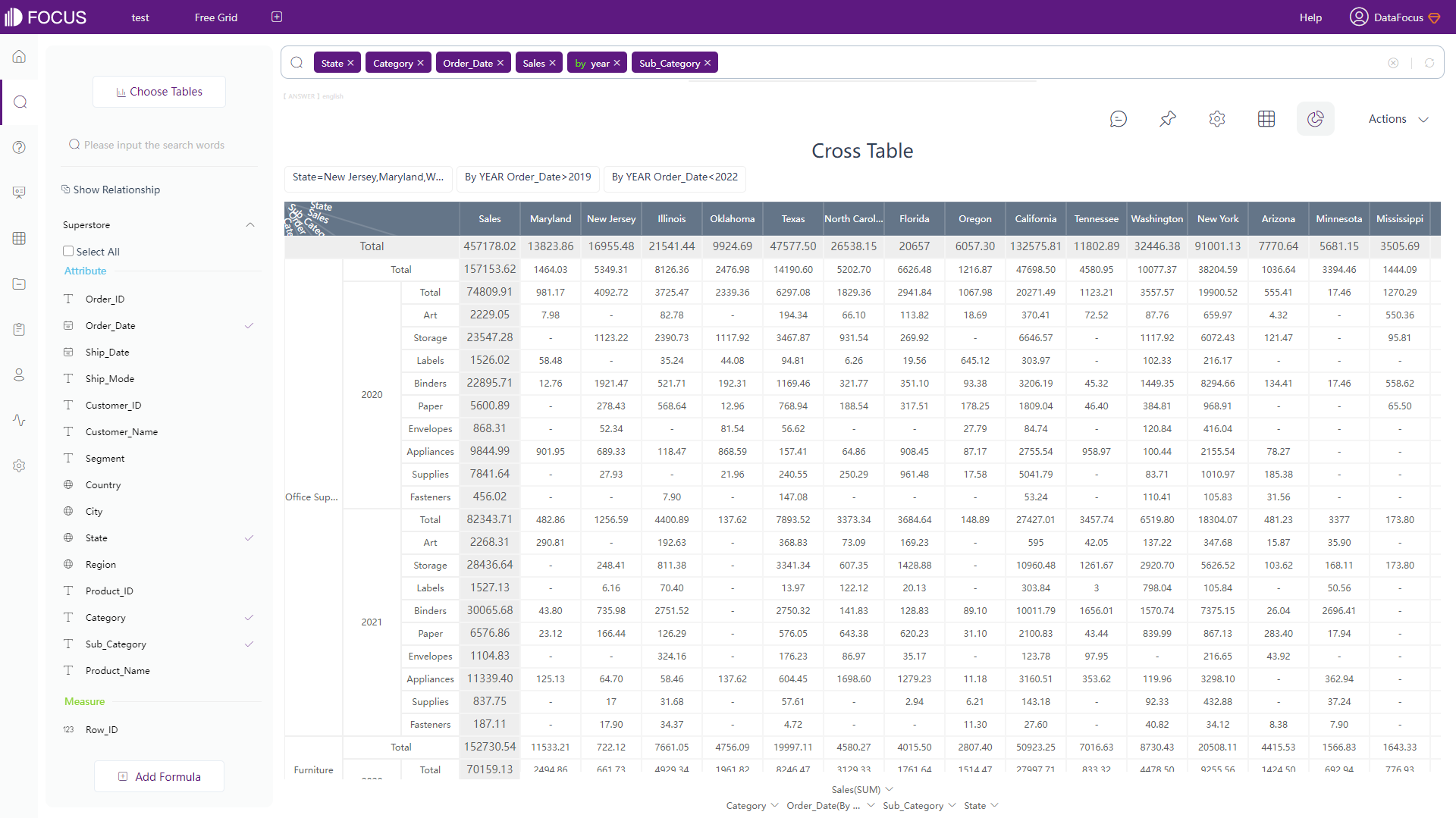
Figure 2-37 Cross table - DFC
-
-
Configuration:
DFC provides more possibilities of configuration. In DFC’s heatmap mode, the color can be customized, negative values can be shown in red. Also, there are two types of heat displayed, transition and progress, as shown in gif figure 2-38.

GIF Figure 2-38 Heatmap mode - DFC In terms of cross table, the headers can be pinned for a clear view, as shown below.
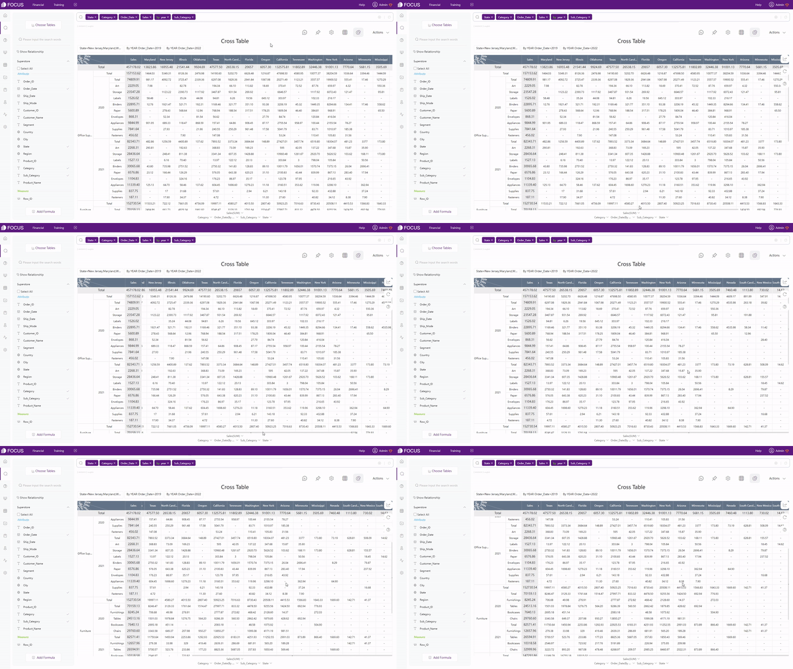
GIF Figure 2-39 Cross table
2.5.2 Chart
There are over 150 chart types in Domo, though many of them are same graphs in different forms, such as maps in different areas, bar and line combination charts, etc. With adequate customization, visualization cards can be designed in various ways.
DFC has over 50 kinds of charts, and most of them are unique types of charts. With a relevantly high level of customization, answers can be configured freely, such as customize the font size, add suspend texts, etc.
To explain further, chart types are divided into four parts:
-
Common Graphics
Take bar chart as an example, the difference is not very large as shown in figure 2-40 and 2-41.
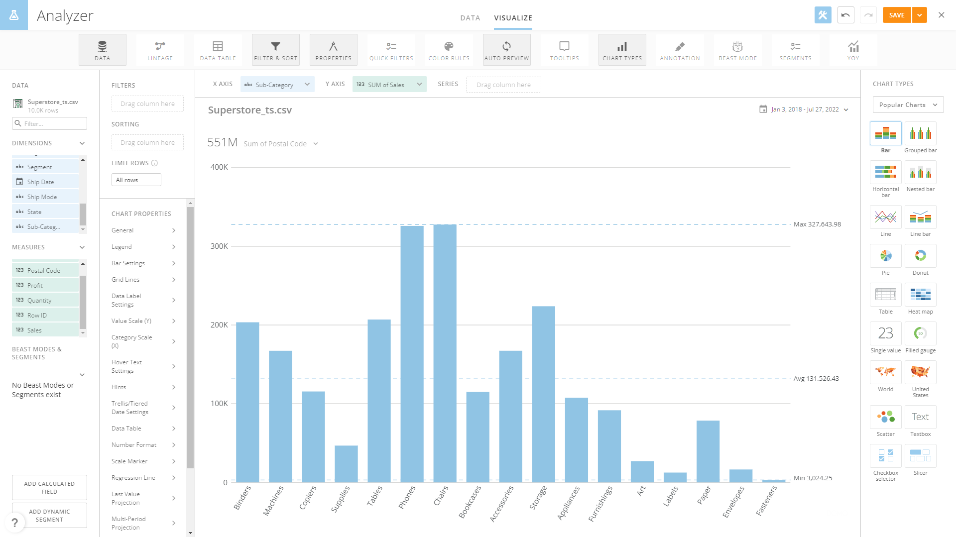
Figure 2-40 Bar chart - Domo 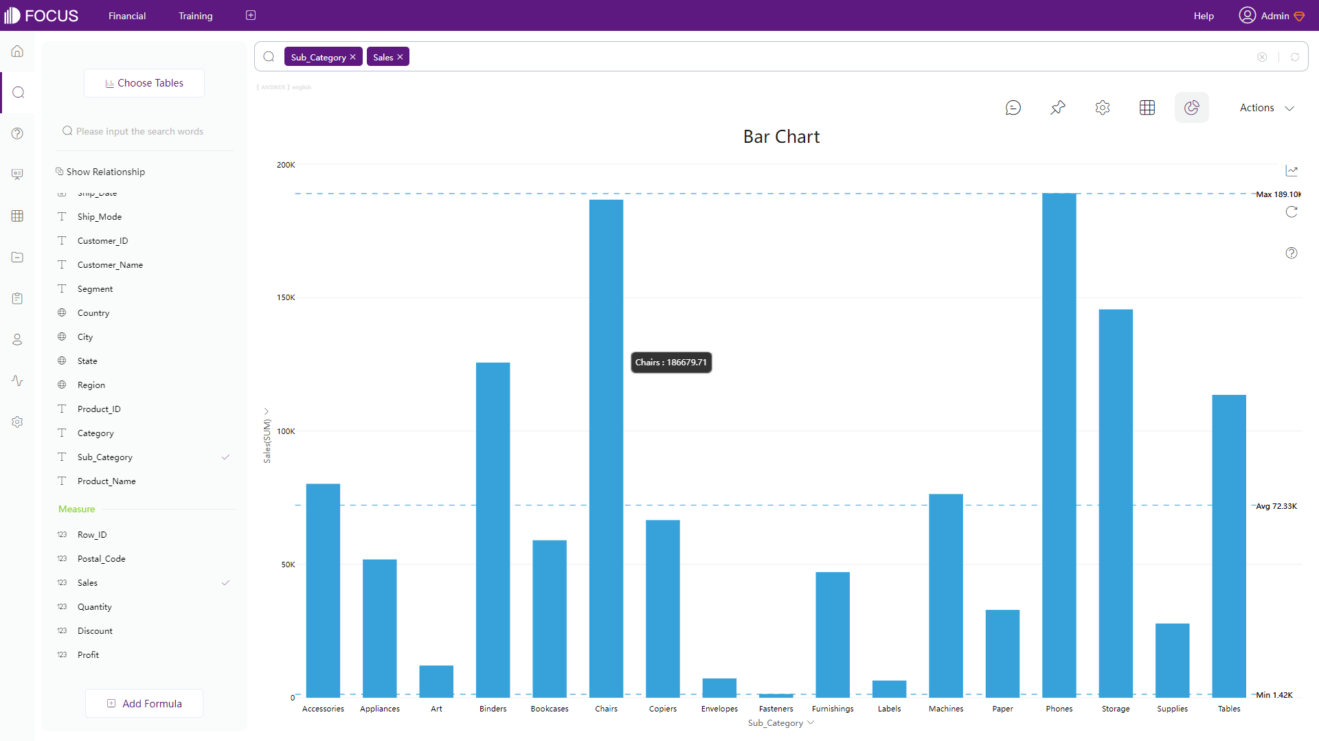
Figure 2-41 Bar chart - DFC -
Maps
Other than maps divided by geographic, such as world map and country map, Domo also provides latitude-longitude map and latitude-longitude route map.
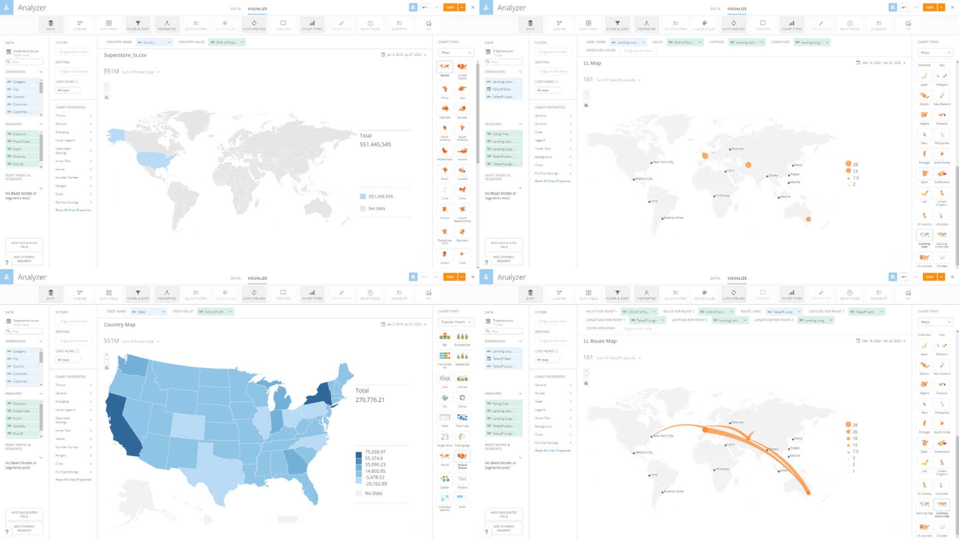
Figure 2-42 Maps - Domo DFC provides different types of maps instead of different area divisions. There are GIS location map, longitude & latitude location map, trajectory map, 3D scatter plot, and etc. What’s more, maps and geographical data can be uploaded freely.
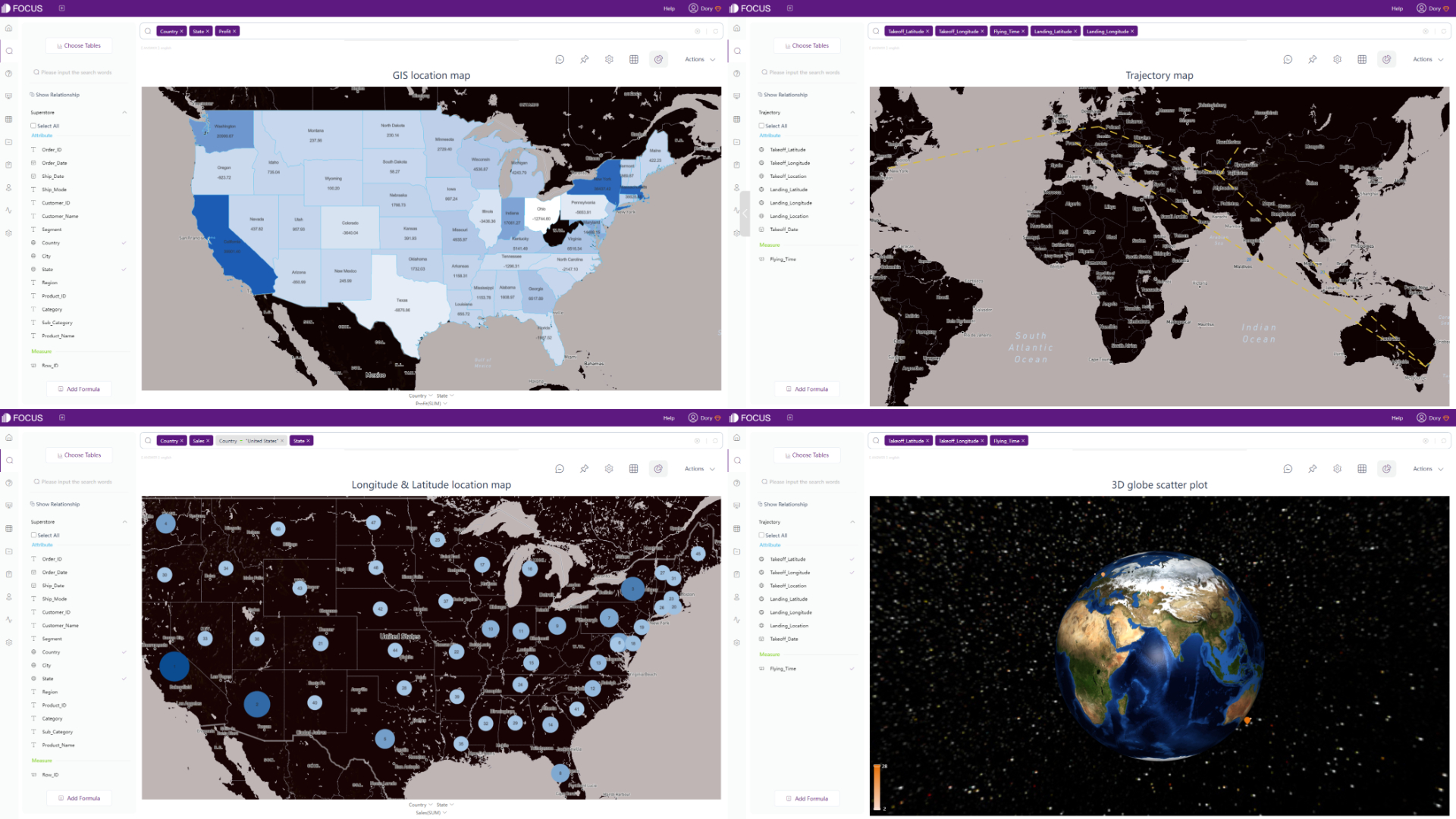
Figure 2-43 Maps - DFC -
Advanced Graphics
Domooffers some statistical charts like predictive modeling and forecasting, and category scatter chart, bump chart, etc.
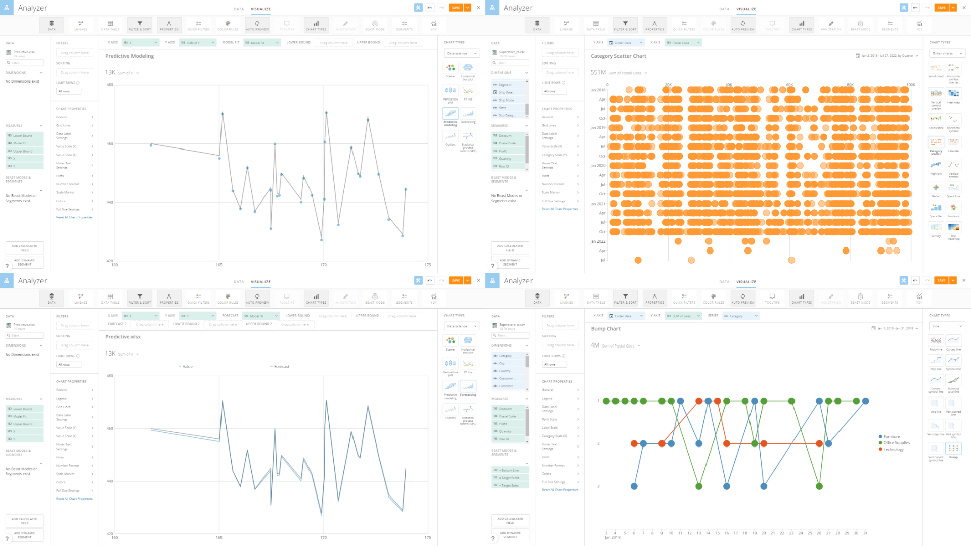
Figure 2-44 Advanced graphics - Domo Some advanced charts provided by DFC are chord diagram, network diagram, package diagram, parallel coordinate chart, etc.
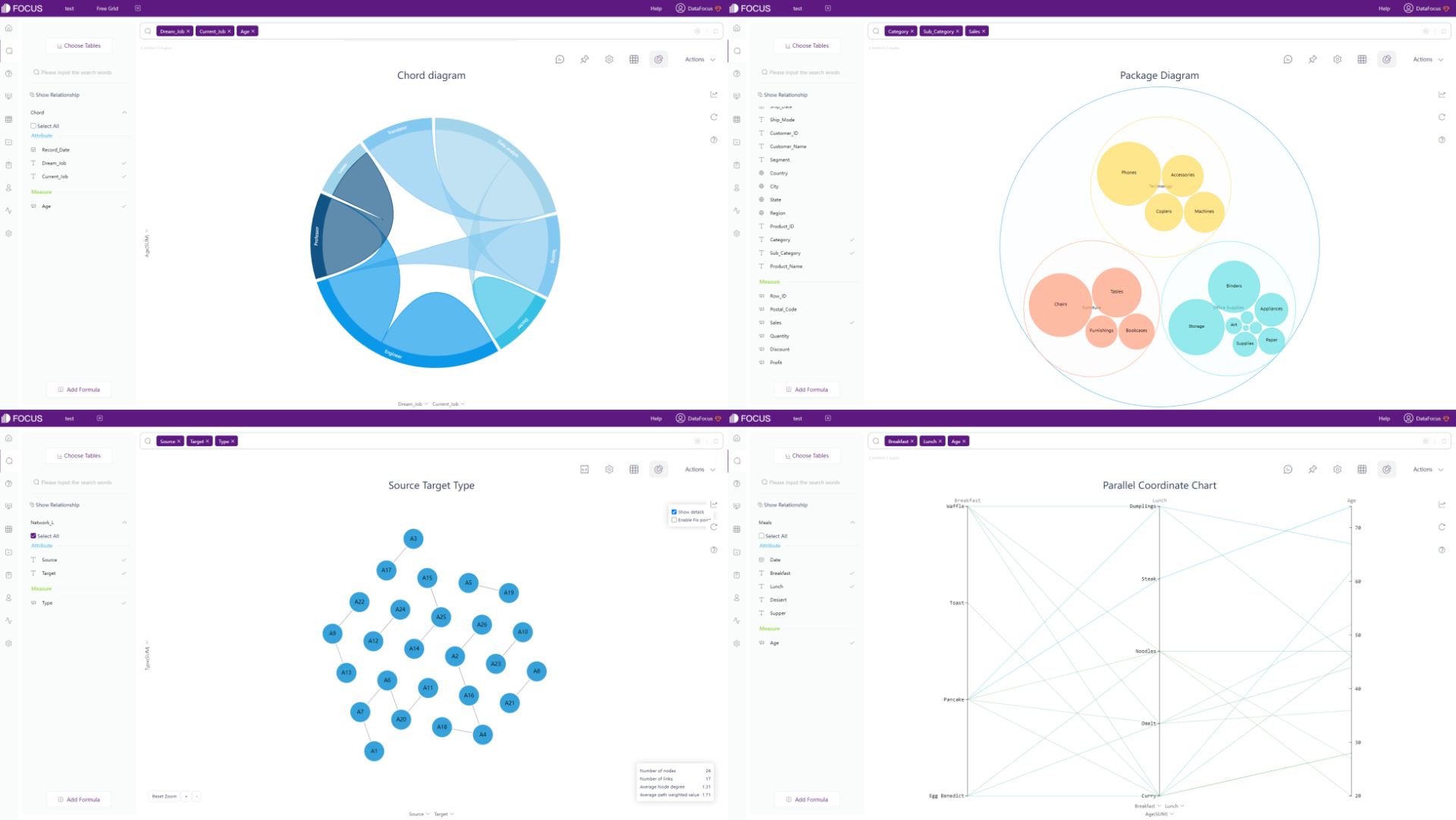
Figure 2-45 Advanced graphics - DFC -
Dynamic Graphics
Dynamic charts are also supported by DFC, such as 3D globe fly line (the animation can be turned off) and time series bubble chart.

GIF Figure 2-46 3D globe fly line 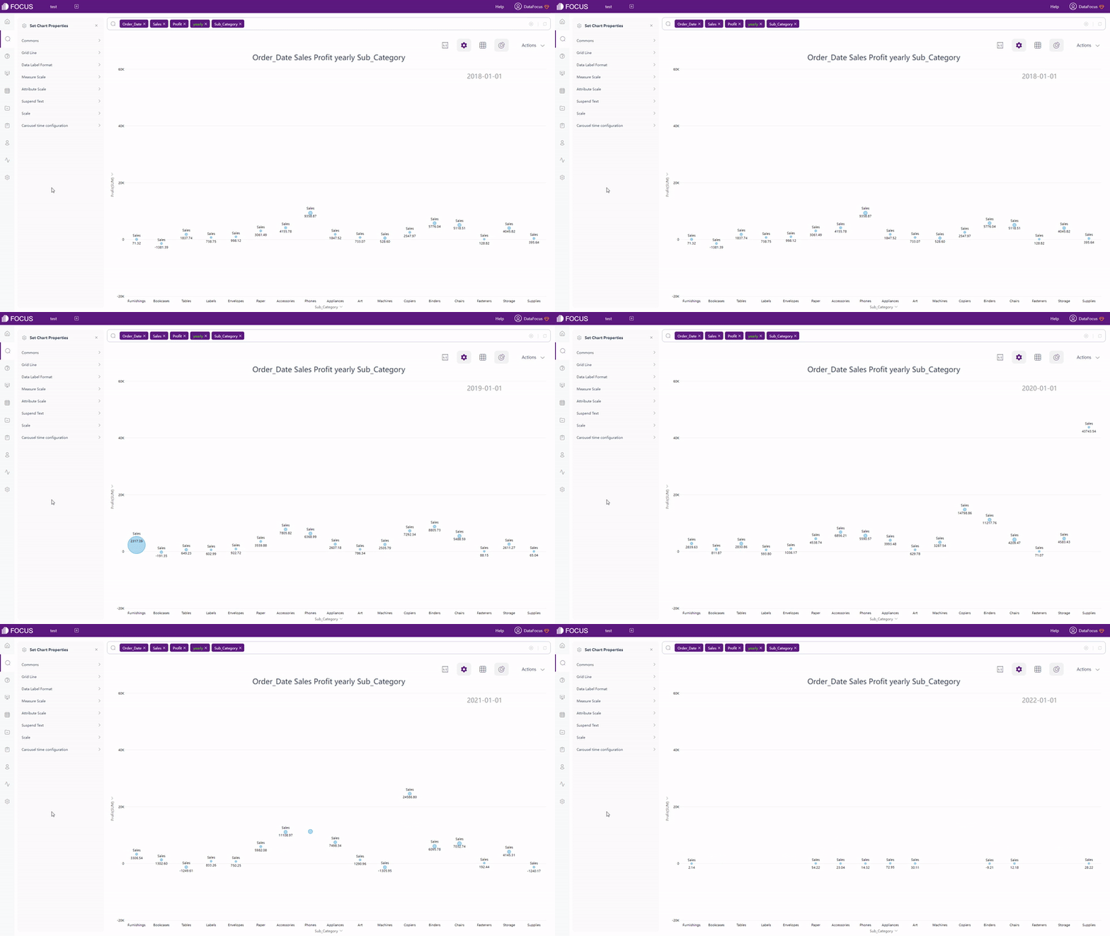
GIF Figure 2-47 Time series bubble chart
2.5.3 Dashboard
| Aspect | Domo | DataFocus Cloud |
|---|---|---|
| Dashboard Size | Desktop & Mobile | Customized |
| Layout | Preset grids | Free & Grid |
| Interaction Objects | Header, image, text, app | Text, image, video, media… |
| Dashboard Templates | / | Various |
-
Dashboard Size
The dashboard size of Domo is set, and can be switched between desktop and mobile. While the dashboard size of DFC is customized, users can adjust the size freely by typing the height and width or selecting from preset device sizes.

GIF Figure 2-48 Change dashboard size -
Layout
There are 27 preset layout templates in Domo, as shown in figure 2-49, but users can still add objects freely.
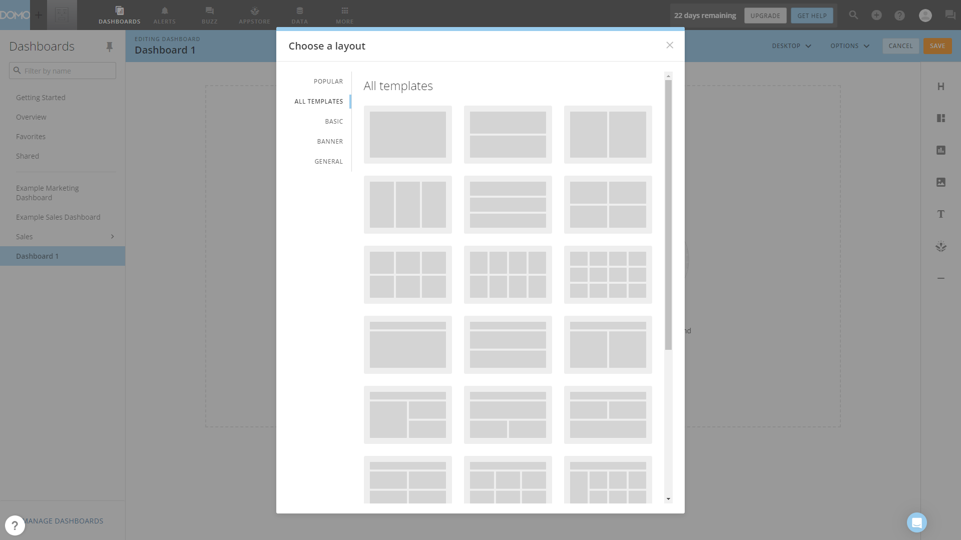
Figure 2-49 Layout - Domo DFC has two layout types, grid layout and free layout. The grids in grid layout can help better place objects and design the overall layout, while users can design the dashboard by their will under the free layout.

GIF Figure 2-50 Different layouts -
Interaction Objects
As listed above, excluding cards(charts), there are four kinds of objects that can be added to the dashboard in Domo.
Similarly, DFC provides text, image, video, media objects, and some other materials. The full list can be seen here: Custom Components.
-
Templates
DFC offers various dashboard templates to help users build beautiful dashboards quickly, as shown in figure 2-51.
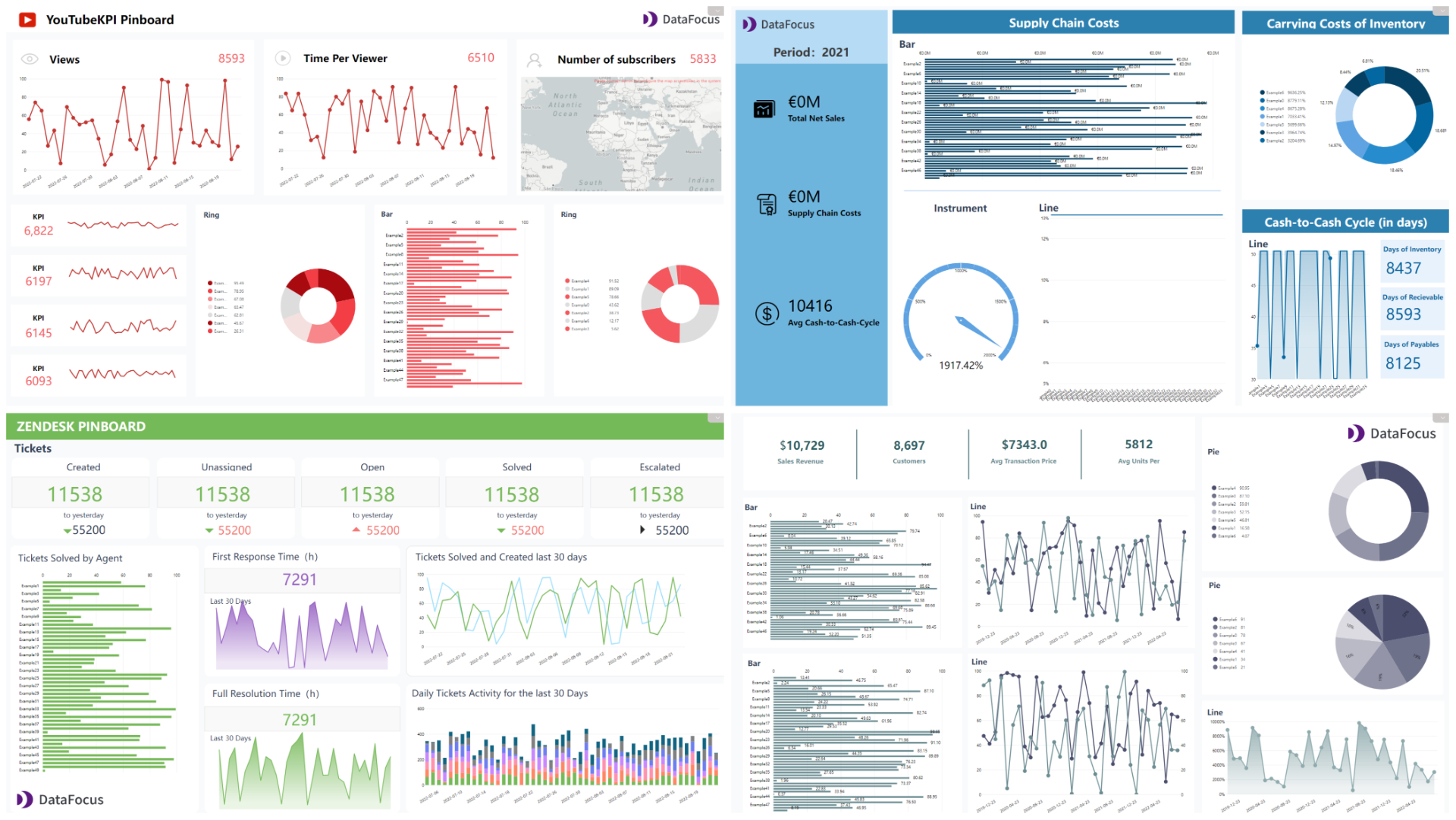
Figure 2-51 Dashboard templates
2.6 Resource Management
Domo and DFC both provide tags to classify resources, as mentioned in section 2.1.5.
-
Charts (Cards/Answers)
Cards in Domo are all listed under “Overview”, and the card size can be changed into four preset sizes.
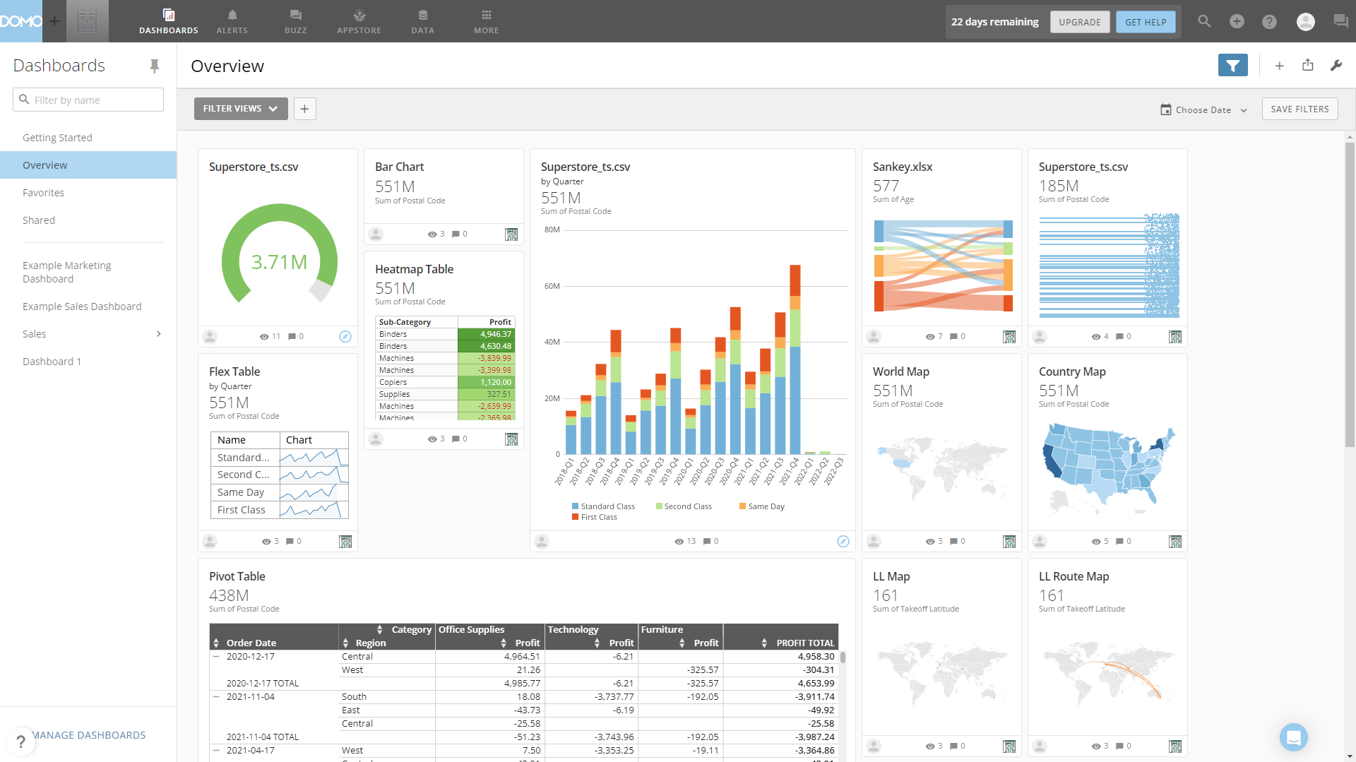
Figure 2-52 Cards management Answers in DFC are stored under answer module and resource module, and the display mode can be switched between list and thumbnail.

GIF Figure 2-53 Display mode of answers -
Dashboard
Domo’s dashboards are exhibits on the left navigation bar under dashboard module, and dashboards can be managed by the “Manage Dashboards” button on the bottom of the left navigation bar.
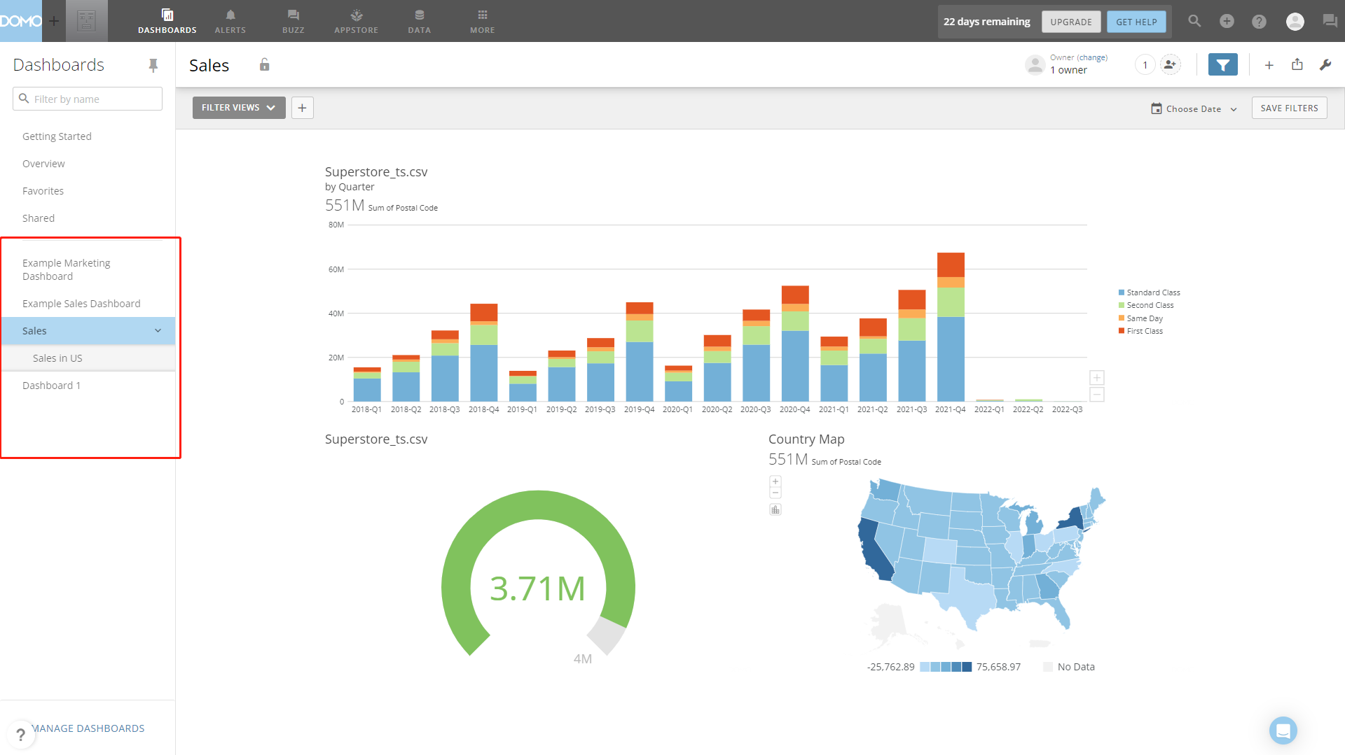
Figure 2-54 Dashboard management - Domo DFC’s dashboards are listed on the dashboard module and resource module. There is a small navigation in the modules to switch between different resources. Also, users can type the resource names in the search box to quickly find them.
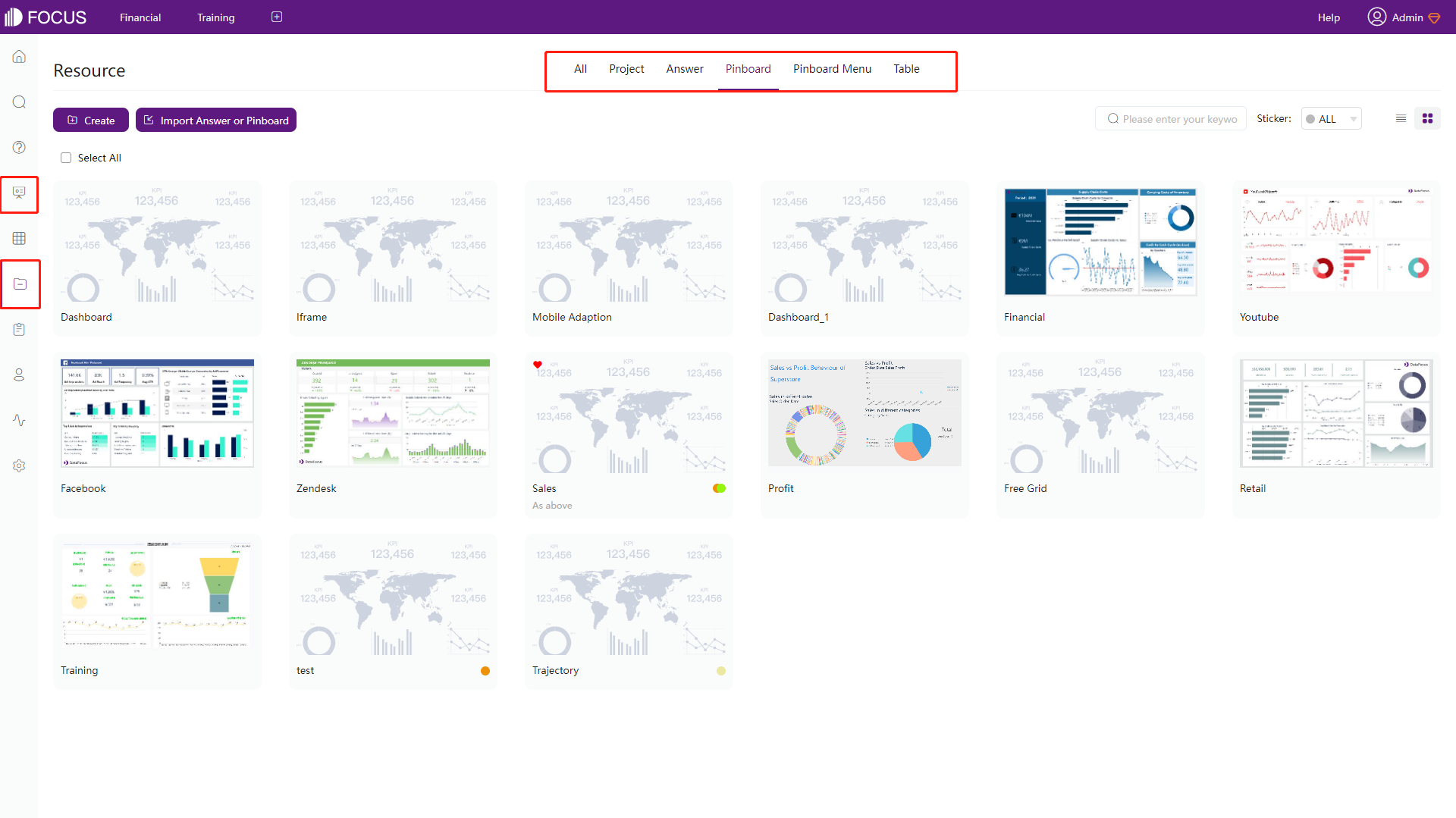
Figure 2-55 Dashboard management - DFC
2.7 Collaboration
2.7.1 Roles & Grants/Permissions
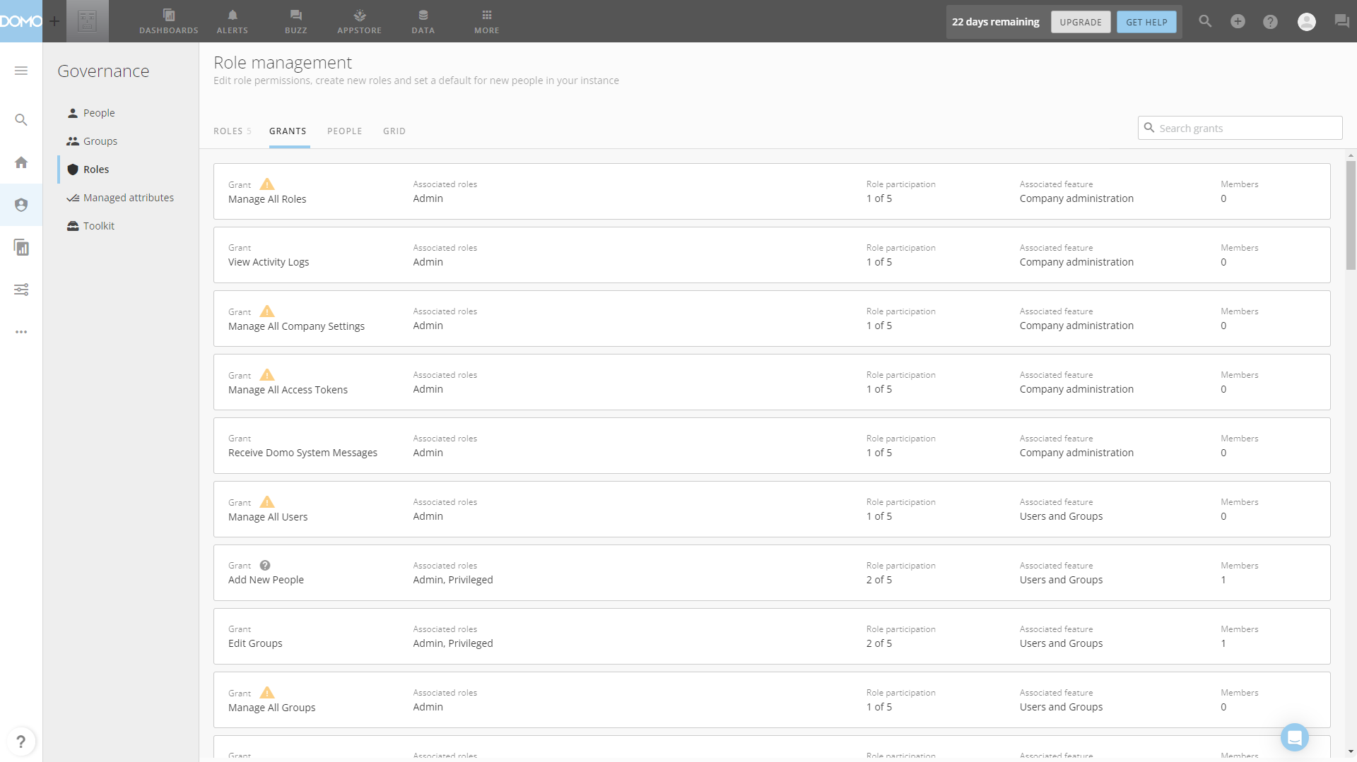
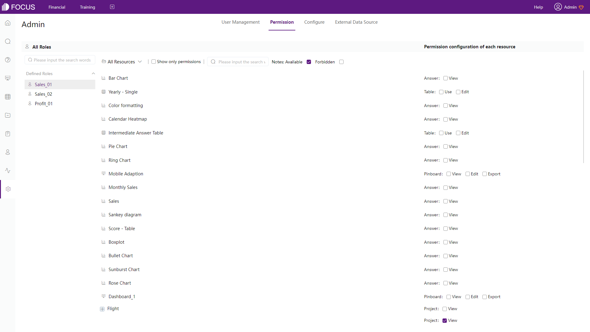
There are both system defined roles and custom roles in Domo and DataFocus Cloud, where different roles have different operation rights. Domo assigns roles with grants, while DFC assigns roles with permissions.
Domo’s grants are more detailed and are mainly divided in terms of different modules. While DFC’s permissions are especially for custom roles, and are set for each resource. Note that each user in Domo can be assigned with one role and multiple roles can be assigned to DFC users. See how roles work in DFC here: Roles.
2.7.2 Groups/Departments
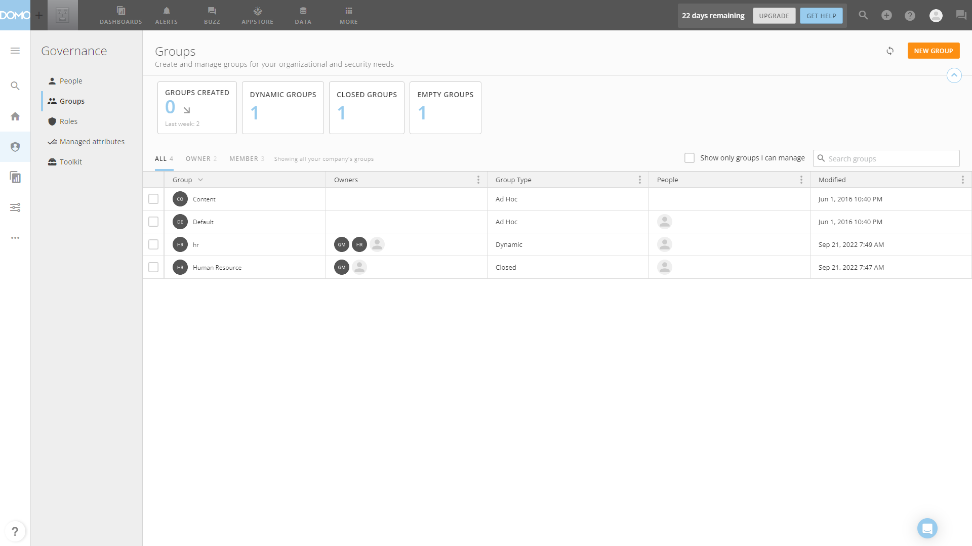
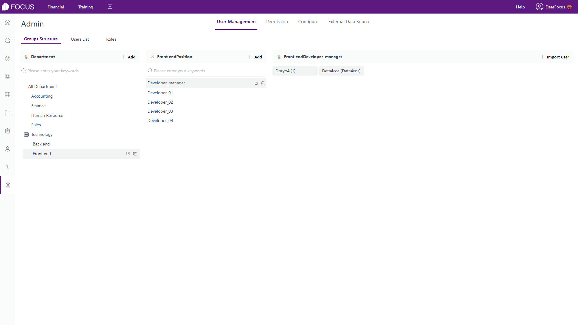
Groups in Domo have different types to manage members, while group structure in DFC is more similar to reality departments and are displayed in a tree structure. Also, in DFC, positions are assigned to users and users are assigned in different departments. Therefore, with roles, different members can do different extends of operations or view different resources.
For example, “Front End” “Developer Jessie” from “Technology” department can manage new resources relevant to project A. The full information about department structure can be viewed here: Department Structure.
2.7.3 Share
Users can share cards and pages with users as well as groups, or though emails in Domo, and messages can be added and sent.
Similarly, resources can be shared to members easily in DFC. Also, there is another way to share in DFC, which is by external viewing address. Using a link or a QR code, resources can be shared to external users. However, the resource shared in this way can not be edited, external users can only interact with them.
2.8 Cost
Domo’s pricing is personalized, and users need to contact the sales team.
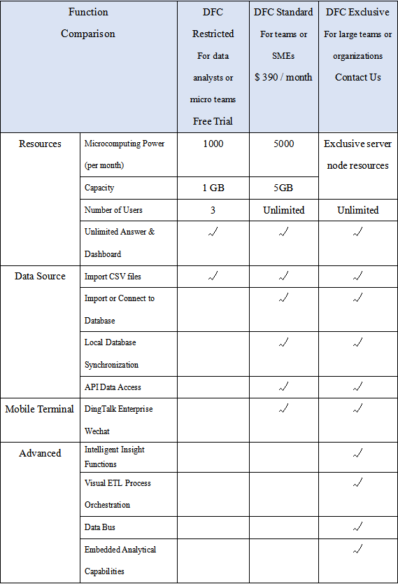
DFC charges by capacity, which is fair, easy to extend inside teams, and less sensitive to the number of members. Here is the detailed pricing plan of DFC.
3. Conclusion
The two BI platforms are great in terms of helping users make decisions through data analysis. The differences are explained by interface, ease of use, visualization and etc.
Domo has massive data connectors and extensive grants for roles. Though there is too much information in the interfaces, Domo still provides beautiful visualizations and adequate customizations.
DFC has adequate ways of data connection and chart types, but its search-based analytics is super convenient and effective. With a high level of customization in charts and dashboards, the visualization is vivid. What’s more, the collaboration is simple and systematic due to a comprehensive system. Continuing on improving, DataFocus Cloud will try the best to make the usage experience better. Welcome try it here: DFC.
